
I'm a UX Designer and Art Director with deep experience in building brands, team leadership, and conceptual development, across platforms and multi-channel touchpoints. My expertise includes designing B2C, Home Automation (IoT), B2B software products through team collaboration & stakeholder alignment. A consistant brand presence or an innovative product is essential, but only if the user/customer finds it intuitive or meaningful by addressing their needs. If a product isn't meeting their needs or connecting on an emotional level, then the mission for success is missed. My goal is to provide product value for the user by creating visually meaningful, intuitive interactions. I use relevant design thinking methods to simplify complex interactions that will provide brand value for the user and is what drives me and what ultimately will make it successful.
Identifies business goals and user pain points through workshop facilitation, quantitative methods. We'll test, iterate, and repeat until we meet the users' needs and stakeholders’ goals.
Provides pixel perfect visual strategy through a systematic design system management based on atomic design with an understanding of Human-Computer Interaction (HCI) and usability. Strives to design products that are multi platform and intuitive with simple interactions to complex tasks that will delight the user.
Spearheaded advertising campaigns, built brands across channels, directed, ideated, collaborated, and inspired copywriters, photographers, and designers to take the brand to the next level.
Starting from concept to completion you'll get hand crafted designs that inspire, inform and built to captivate in all mediums.
I’m a visual designer that thinks strategically. I can lead teams and create integrated marketing communications (digital, CPG, tv, print, socially branded content) I have deep experience branding efficiently across platforms and multi channel touch points for national brands like Denver Grand Prix, Coors, Dannon, Gillette, HP, Kelloggs, Moosehead Lager, & Tide, Royal Gorge Route, Unilever Dove.
As a product designer I use Design Thinking methods to understand the users problems to create innovative solutions. I'm passionately focused in UX Design with experience in B2C, B2B, Enterprise & Home Automation (iOT) software products. I've learned the importance of transparency, team collaboration & stakeholder alignment to create a product that is inline with business goals. I strive to provide product value for the user by creating visually meaningful, intuitive interactions that bring the user delight.
My background as a Art Director and UX Design methods has made me a well rounded advocate for the user experience no matter what the medium.
As a part of BrightAI, I worked with a distributed team of product owners, designers and developers to bring real world AI data to IoT devices.
I build digital products for small agencies to large in-house departments by providing services from UX & UI Design to Creative Branding solutions. I use Design Thinking Methods to research and identify end-users and their needs to solve problems, simplify interactions and offer soultions to meet business goals.
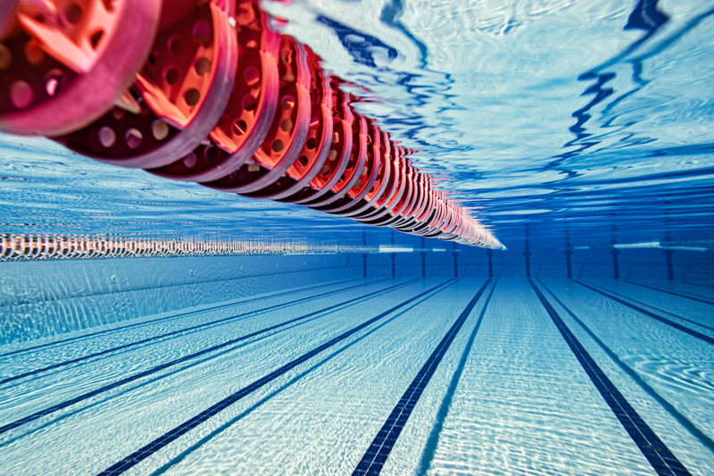
As a part of Fluidra's IoT department, I worked with a distributed team of product owners, designers and developers on the company's B2B, B2C modules in a SaaS network in the swimming pool industry.
I worked as part of the BaylorScott Whites developer teams to improve the interaction & UI for their Doctor/Patient mobile app.
I was hired to support their current UX Designer and to elevate the UI orignially created in Axure for their B2C Motor Club app in a Lean UX workflow.
I was hired to adapt their web based responsive financial software to iOS tablet for their sales team. Their goal was to get the product in a functional working prototype to gain additional funding from the board to take it into a native environment.
I was hired to lead a team of 4 designers in the development of direct response campaign for for Unilever - Dove Brands.
Design a website for dinner train experience in the Royal Gorge, CO. royalgorgeroute.com
Client: Hewlet Packard
Role:Led a team of 5 art directors and 1 copywriter in the development of interactive design, packaging, retail marketing, print ads & digital content video content for HP featuring their new laptops, speakers & customer assistance programs.
Client: Danone Yogurt Brands, N. America/Global
Role: Led a team of 5 art directors and 1 copywriter in the development of strategy, design and execution of packaging, digital marketing, social media through shopper marketing initiatives
CLIENTS: Kellogg’s (ready to eat cereals & salty snacks for N. America) Kraft, Capri Sun, Seeds of Change
ROLE: Directed and concepted the design on the Kelloggs national retail campaign for consumer key touchpoints (social, web, video, print, displays) Concepted and directed a tv spot that had to be customized for 5 differnt national retail partners. Directed our spokesperson in an one full day session that included a photoshoot and video shoot with client brand director on set.
CLIENTS: P&G (N. America/Global) Tide, Dawn, Ivory, Swiffer, Gillette Venus. Killians Irish Red, Coors
ROLE: Led strategy direction, concept and design for a team of 2 art directors and 1 copywriter
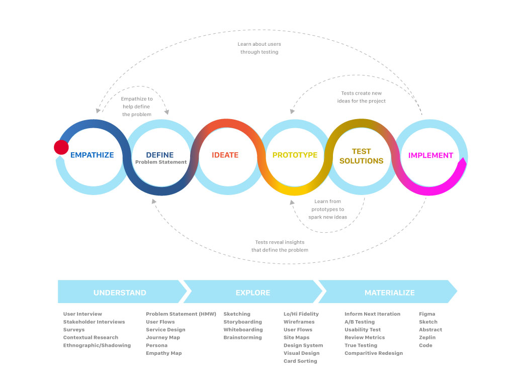
Design thinking is a non-linear, iterative process to understand users, challenge assumptions, redefine problems and create innovative solutions to prototype and test. There are points within the process that are ideal for discovery, empathy & prioritization workshops of which I hope to facilitate more in my career moving forward.
WHO, HOW, WHY
Methods used: User & Stakeholder Interviews, Surveys, Contextual Research (Field)
In this phase the design thinking process aims to gain an empathic understanding of the issue or problem at hand. Empathy is crucial to a human-centered design process, and empathy allows design thinkers to set aside their own assumptions in order to gain insight into consumer-users and their needs.
Define users needs, their problems and provide insights
Methods used: Storyboards, User Flow, User Journey, Personas
Now I can put together the information I have created and gathered during the empathize stage. I'll analyze our observations and synthesize them in order to define the core problems or issues our team have identified to this point – stated in a problem statement that is human-centered in nature.
Challenge assumptions and create ideas for innovative solutions
Methods used: Sketching, Whiteboarding, Brainstorming
Now we're ready to start generating ideas. I've grown to understand the users and their needs, and I’ve analyzed and synthesized my information to end up with a human-centered problem statement. With this solid background, I can start to ‘think outside the box’ to identify new solutions to the problem statement we've created, and we can start to look for alternative ways of viewing the problem.
Design and prototype to start creating solutions
Methods used: Lo/Hi Fidelity Wireframes, Uer Flows, Site Maps, Design Systems, Visual Design
We are now in position to produce a number of inexpensive, scaled down versions of the product or specific features found within the product, so we can investigate the problem solutions generated in the previous stage. Prototypes may be shared and tested within the team, other departments, or on a small group of people outside the design team.
Test solutions
Methods used: A/B Testing, Remote Testing (Lookback, Usability Hub), Surveys (Google docs, Survey Monkey), True Testing, comparative baseline testing
We are now able to try out the complete product or features using the best solutions identified during the prototyping phase. This is an iterative process where the results generated during this testing phase are often used to redefine one or more problems and inform the understanding of the users, conditions of use, how people think, behave, and feel. In this phase, alterations and refinements can be made in order to rule out impractical problem solutions and deepen our understanding of the product and users.
Build and Launch
Methods used: Figma, Sketch Cloud-Abstract, Zeplin, Code Library
Produce assets for the dev team and provide requirements to ensure the design intent is carried through to final deployment. I’ll usually work with QA testing on beta versions to check that interactions are as designed.
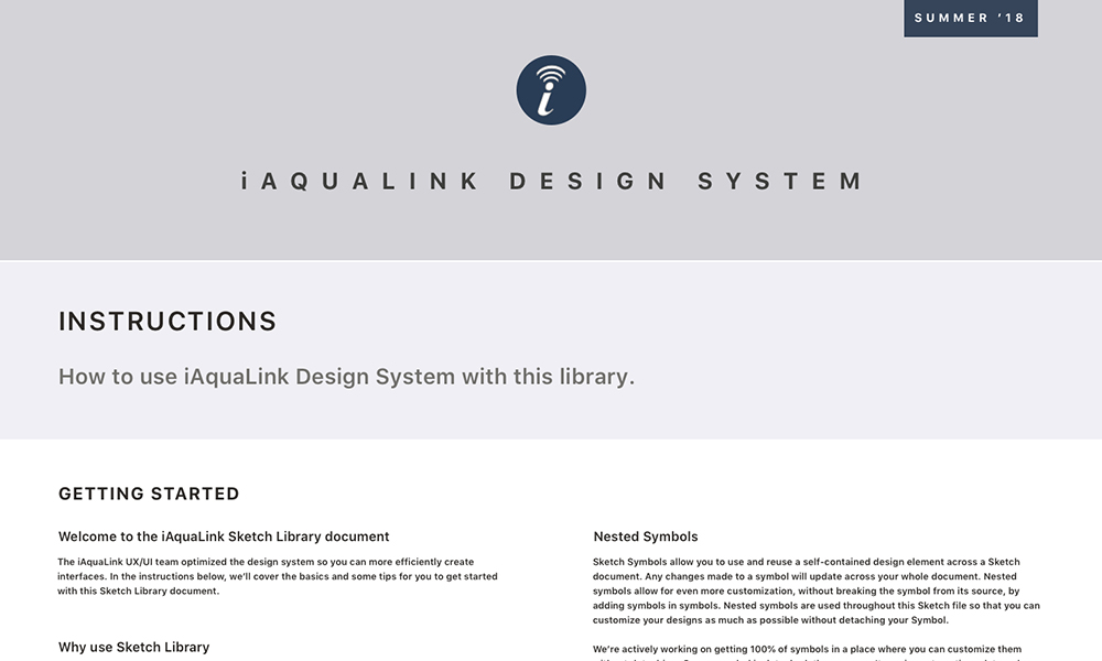
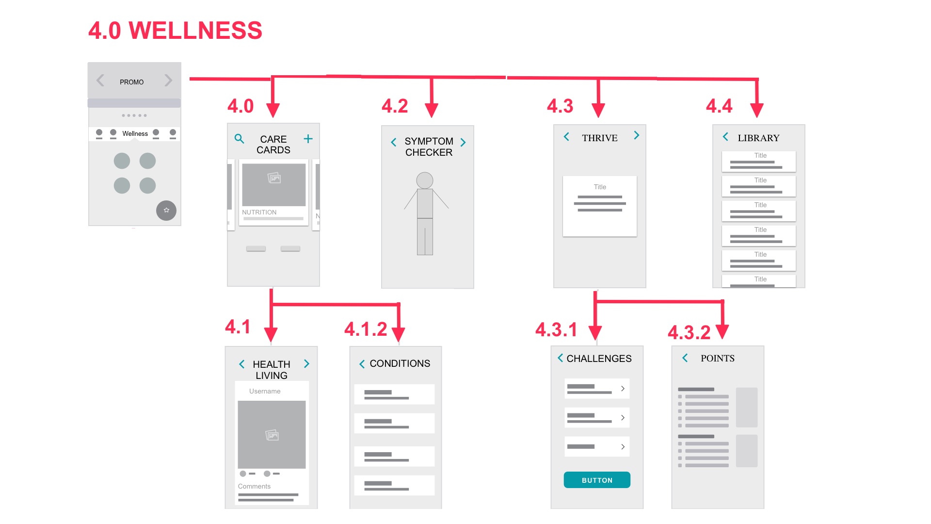
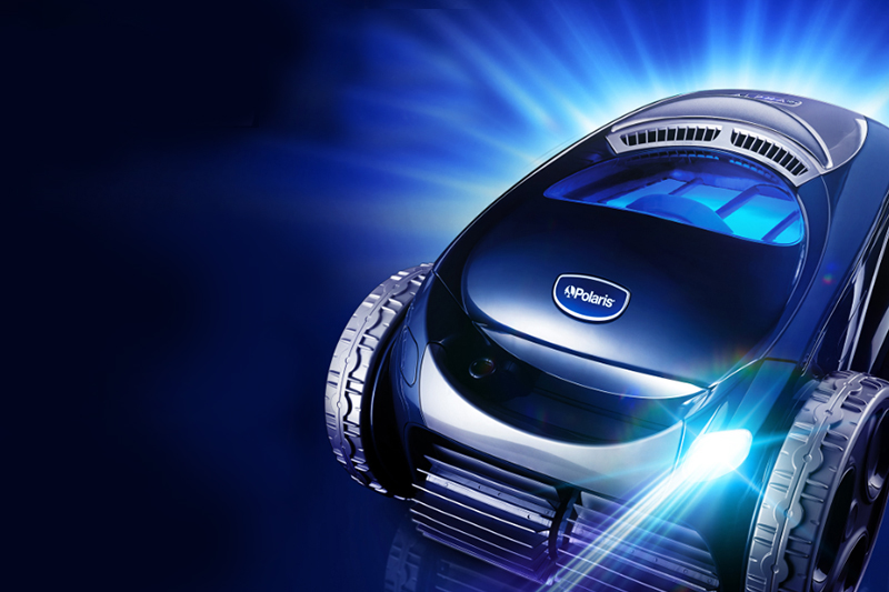
Aqualink had two main users we wanted to focus on for our values, the homeowner and the pool professional. I facilitated an Infinity map exercise where the team (another ux designer, (2) product managers, (2) dev leads) came together to discuss app requirements based on user feedback and customer operation interviews.
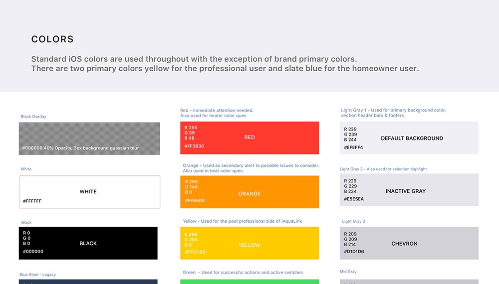
We started to identify patterns or groups to define our values and wrote statements to define our principles. The principles and values were then applied to the style guide. This was first the app module that was used as a benchmark for four other modules that would follow.
An innovative, intuitive global product that instills confident through usefulness and connectivity for a perfect pool experience.
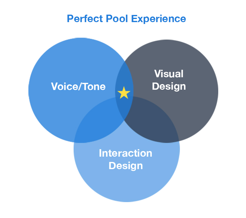
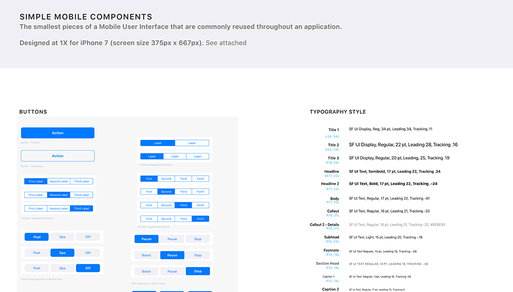
I proposed we use native UI elements to maximize user mental models and development efficiencies. I built the style guide based on Atomic Design where key screens can be built from from smaller components and nested symbols. Our global partners could import the artifact to take advantage of Sketch's power symbols libraries ensuring brand consistency.


Problem: Users wanted easy access to overall status of their swimming pool from chemicals to equipment such as lights, water features, and automated pool cleaners.
Solution: Status alerts would appear as a card modal with instructions on how to solve them. This was used in other product modules that would follow.
Result: Users felt more in control of their pool pad and confident to address any concerns that might pop up anytime.
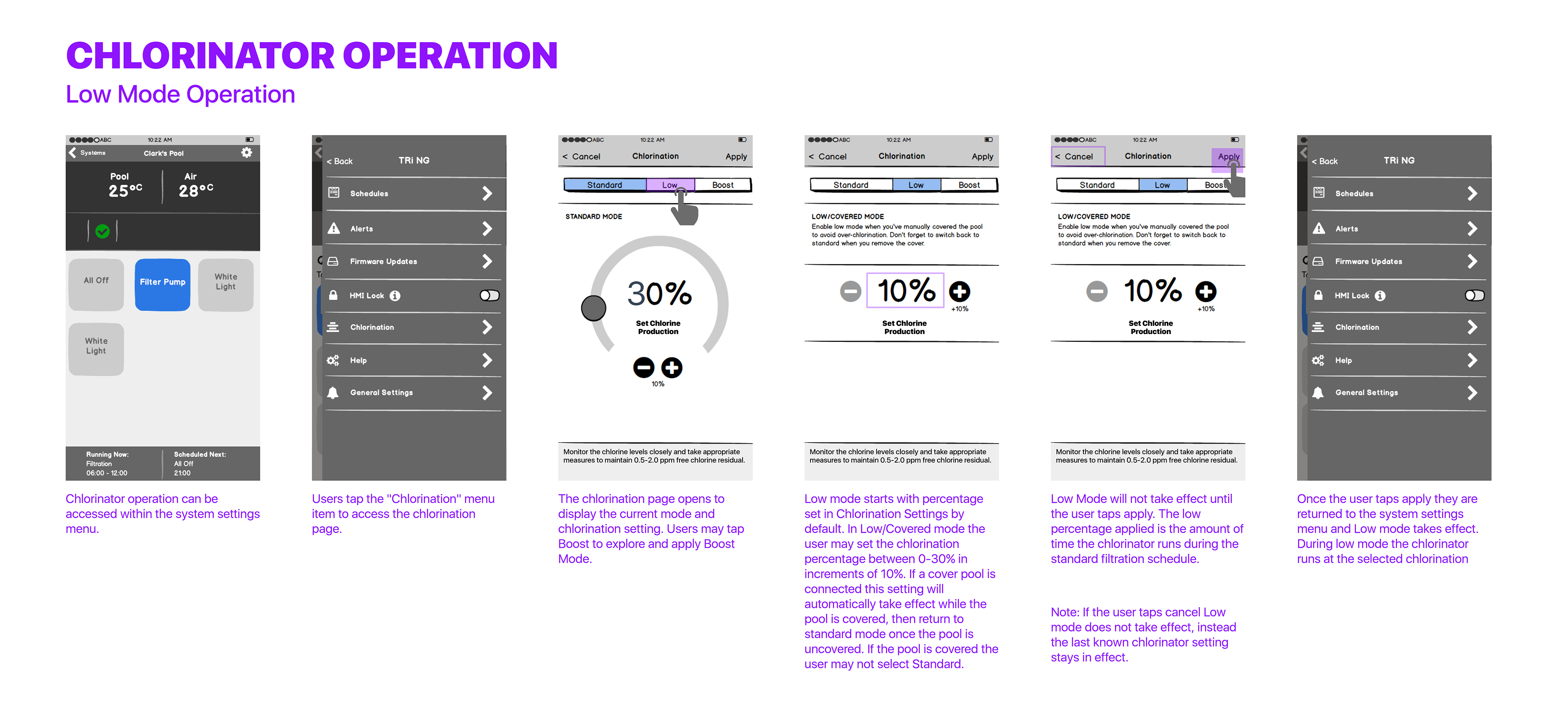
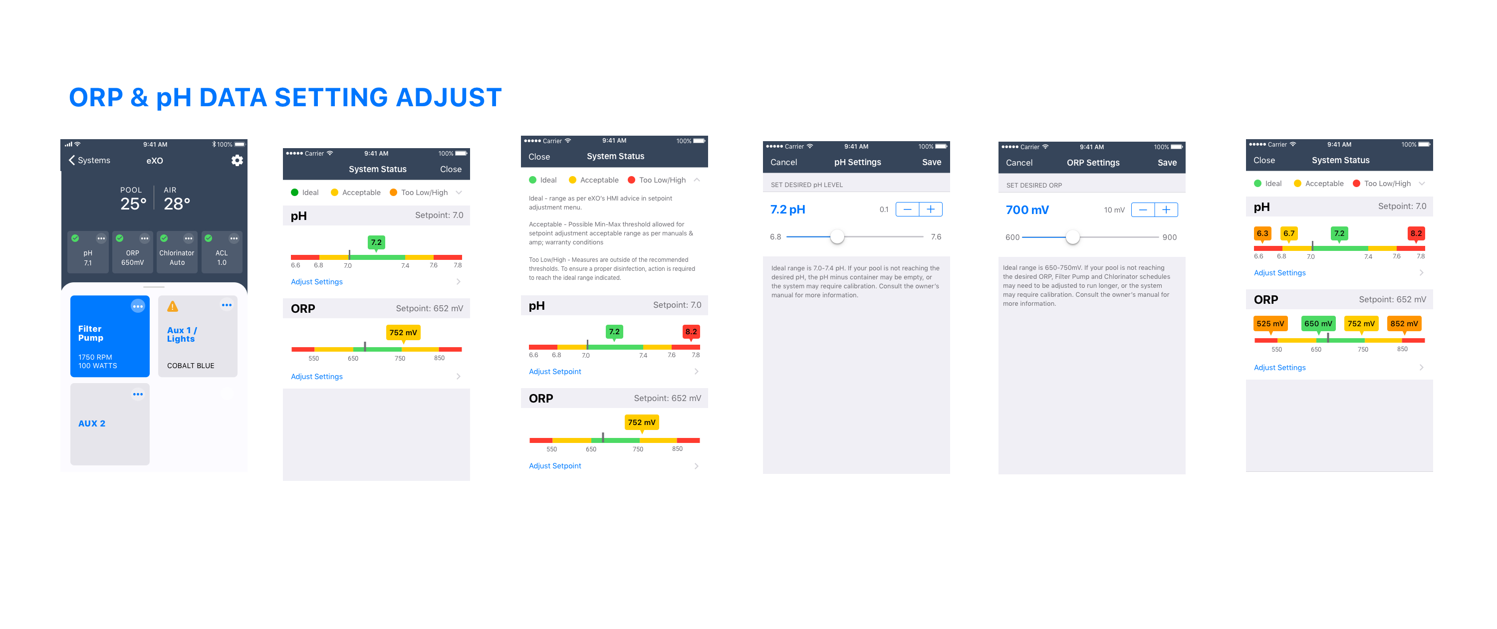
Background: The product was released as a MVP in the European Market where salt water pools are preferred. Some features will be used in other modules moving forward. The Salt Water Chlorinator (SWC) is one of the main selling points of the app, it creates a chemical reaction to chlorinate the pool water during the filtration cycle. The module app allows the pool tech or homeowner to preset chlorine production based on their use case.
Challenges: Feedback from the MVP release indicated users would like to see chemical balance status indicators without wayfinding the menu. Users wanted quick visual feedback to alert them if the water was getting acidic or chlorine levels low.
Solution: We had our design studio that included product owner, developer, QA & another designer. We discussed status requirements for chlorination readings. We knew we wanted to provide users current set points with color coded bars. We discussed various ways we could address these issues and quickly sketched various directions. We took what was working from the sketches and design lo-fi wireframes to test.
Role: UX & UI Product Design
Tools: SketchApp, Balsamiq, Invision Studio
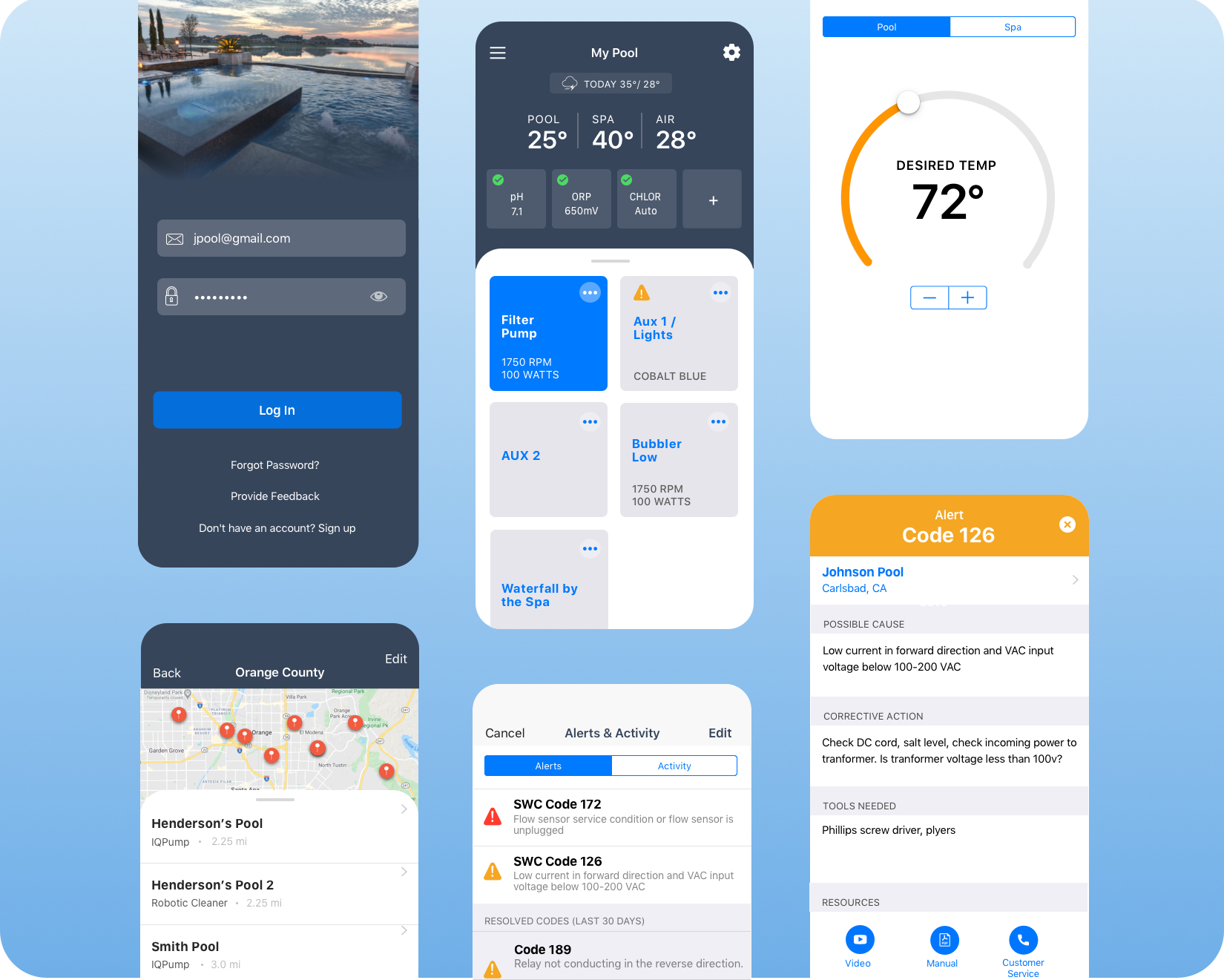
App Store: iAquaLink
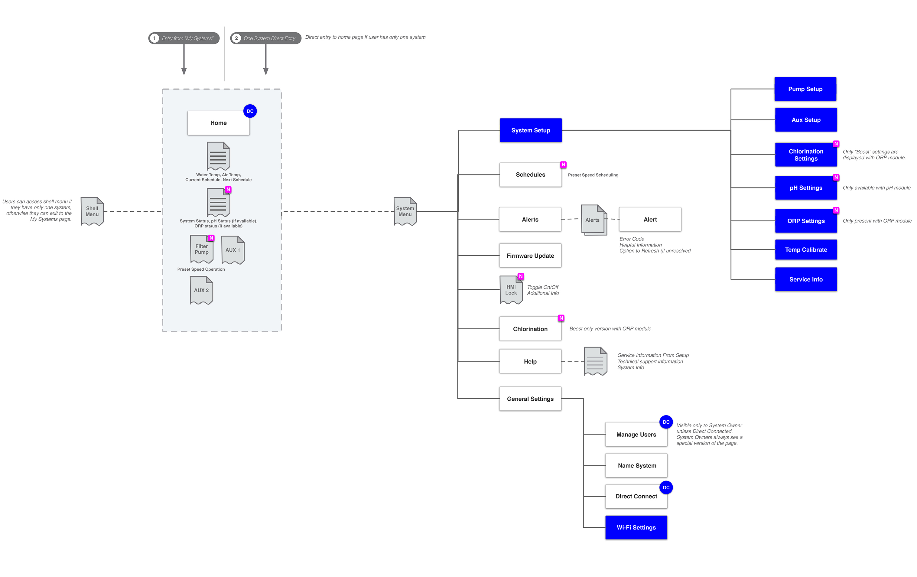
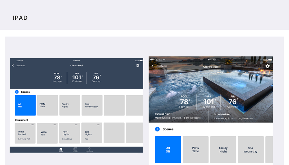
Architecture: To quickly communicate navigation and hierarchy, card sorting was used for the framework as it evolved with feature deployments. User features (in blue) were determined by connectivity to the Power Inlet Box.(BT, WiFi).
Chemical Adjustment (Lo-Fi Wireframes): Lofi wireframes allowed us to quickly get concepts in front of the product owners before testing chlorination adjustment.
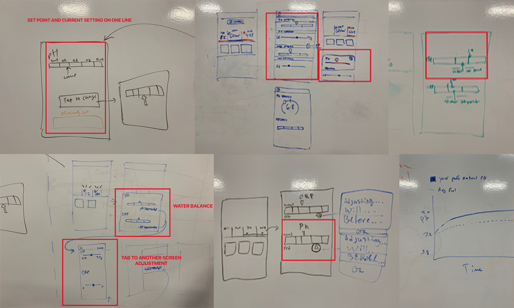
Design Studio: In the design studio we reviewed feedback and requirments for this design challenge. Included were product owners, developers, QA, and other designers to sketch out solutions before lofi wireframe and user testing. It was a great exercise to get team input we generated some good concepts.
LoFi Wireframe Prototype: This prototype was from our MVP release and show's how far the user was drilling in for adjustment. We iterated and solved for that pain point by reduce the action by two taps.
HiFi Wireframe Prototype: This module shared some features with other modules however the wiring only allowed for two Aux. That meant that its scaling is limited and the tiles could be larger and better communicate operation and viually give the home screen more aesthtic.

App Store & Google Play: The iAquaLink MVP release was comprised of 5 equipment modules integrated within iAquaLink.
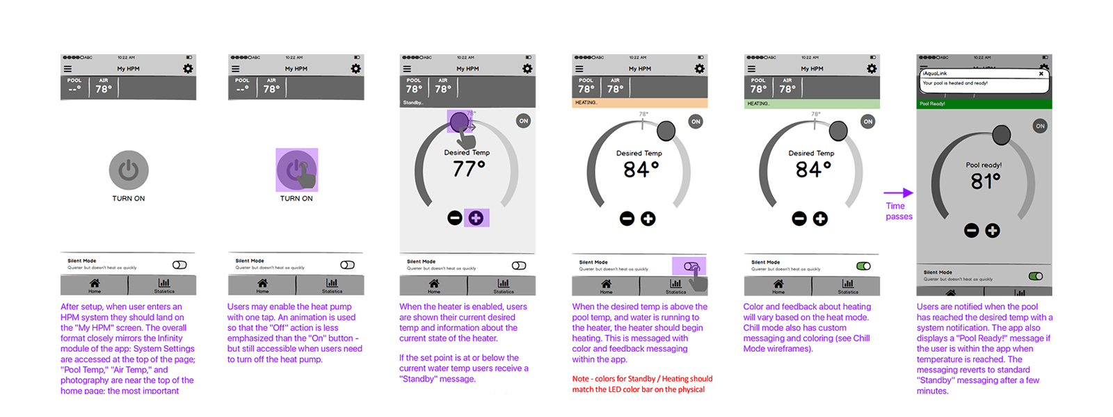
This app remotely controls a European based swimming pool heat pump that can heat and chill the water, so monitoring its use is essential to the user.
• Users found the pump could be noisy at times and wanted a way to control this without sacrificing heating efficiency.
• Statistics were beneficial to cost efficiencies and had to be quickly and easily understood.
Although many factors and conditions for this app van be complicated, I'll be highlighting the design process for Silent Mode, Statistics, and Temp Dial Operation. The home screen design features the main tasks users will most likely want to perform and drive project goals.
Competitive Research & Expert Interviews (customer ops, stakeholders), Mobile iOT understanding, UX Design, UI Design, Prototyping.
I was the UX & UI, visual Design lead for the small team of 4 ios/android developers, 2 product managers (1 located in France), I conducted compeititive discovery work, user research with internal stakeholders, and customer operations, to create a set of design deliverables.
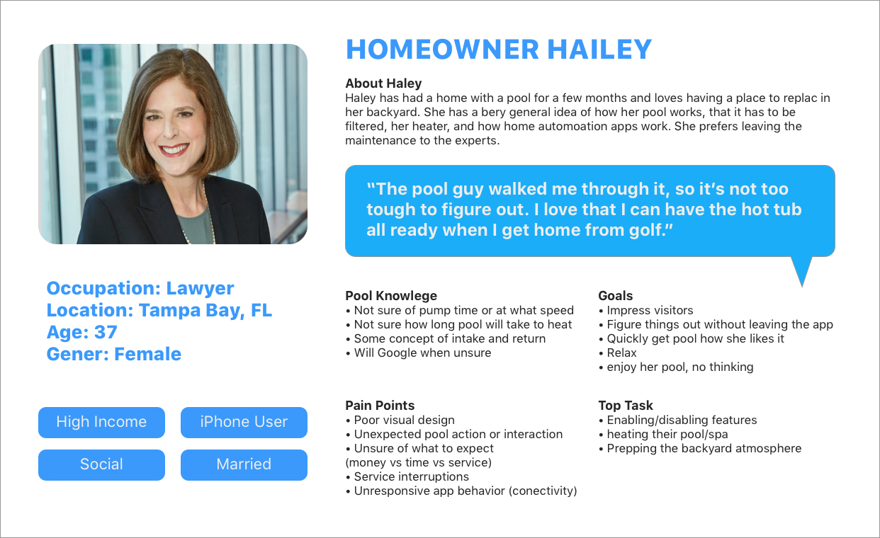
Produce current and trending visual design, test, iterate and release into the wild, and get feedback. This app is geared towards the swimming pool owner “Homeowner Haley”.
Product should allow users to:
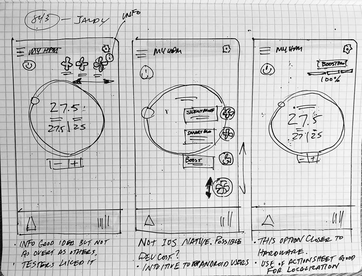
My research mostly involved expert interviews with stakeholders & customer operations. I conducted competitive online research to understand how they are displaying these features. After the MVP release, Stakeholders expressed the need to build on the Silent Mode feature, to provide users informative control. This app was an extension of the hardware interface and I felt we could present Silent Mode with better UI indicators and descriptions.
I sketched three low fidelity solutions and shared with my team, after I obtained stakeholder approval to move forward to conduct gorilla testing. Once we felt we were in a good place I moved onto hi-fidelity prototypes to test through "Lookback" with five remote users.
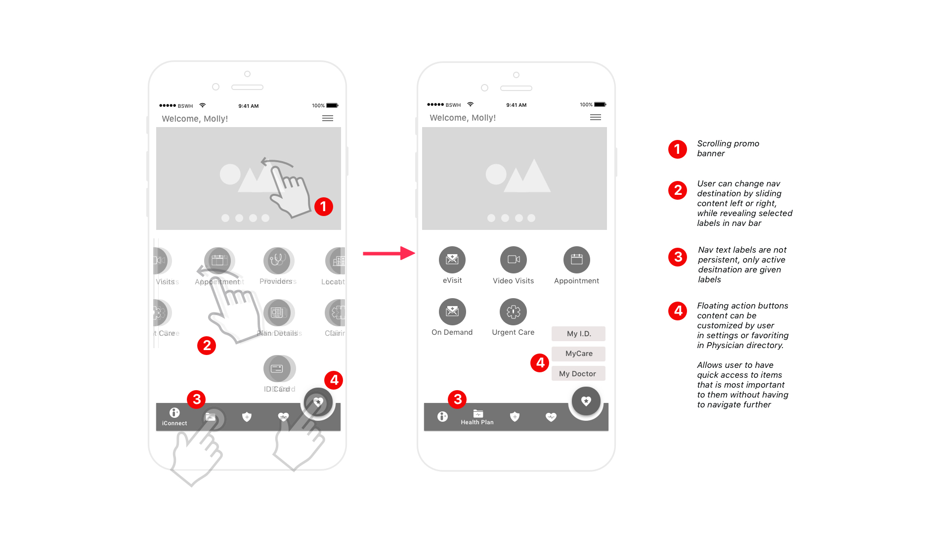
Opt 1 featured a floating action button as used in Material design, but the iOS engineers thought there might be a dev cost, we decided to get feedback anyway to see where we stood.
Opt 2 focused on the different compressor fan icon states with an info icon to explain the settings but required a little more discovery on the user's part.
Opt 3 used a tappable action sheet menu with informative text for each setting which provided plenty of room for localization. Users preferred a progress bar over the fan icon menu since it resembled the unit's fan speed LED. Users had a mental model for the action sheet menu and ultimately found it intuitive.
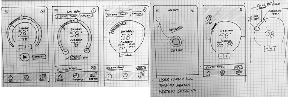


These were just a couple examples of how I executed each feature. Many of the features were based on firmware logic and we went through many exercises from afininty maps to prioritized features for MVP. I worked closely with prodcuct managers, firmware engineers and stakeholders to discuss and finalize user flows for all the features. It started with whiteboards, then lo-fidelity, hi-fidelity to testing before loading onto Zepin for single moment of truth for the developers as we worked through the backlog.
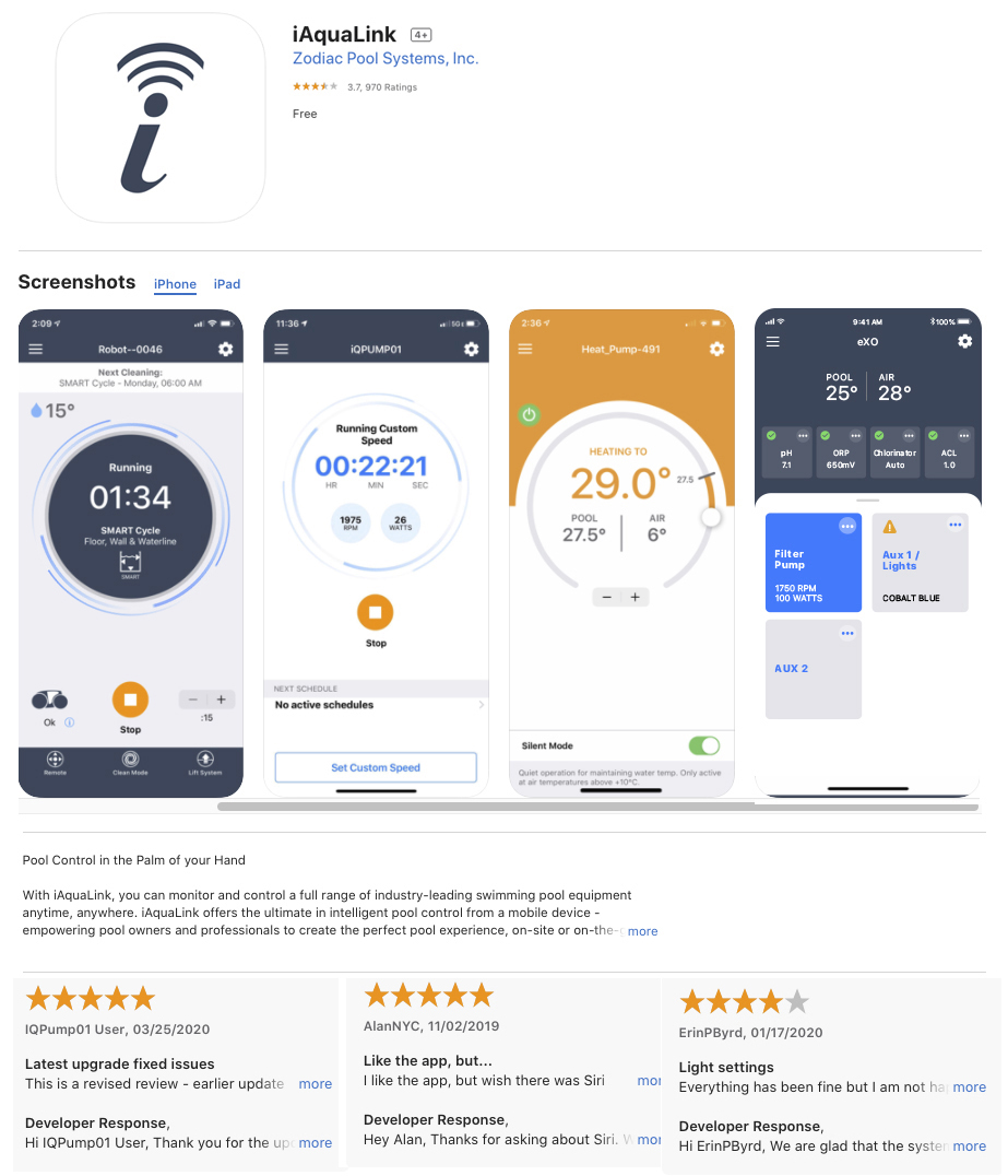
App Store & Google Play: The iAquaLink MVP release was comprised of 5 equipment modules integrated within iAquaLink.
In this case study I'll introduce the design process for three aspects of this app, Home Screen, Clean Modes & Spot Clean. I'll discuss what was involved in the design, my role and who I worked with and what we discovered.
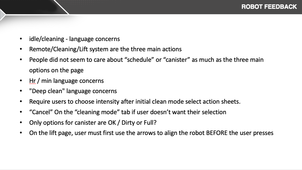
For this product I focused on our primary persona “Homeowner Haley”, who wasn’t interested in learning anything new to operate the pool cleaner due to lack of product knowledge, product confidence and relied on mental model interactions. Qualitative app store feedback indicated the UI looked dated and user perception, was low confidence even though performance was good. Through analytics we found that moderate amount of users weren't taking advantage of custom features even though the use of them would optimize cleaning time of the users pool and extend the product life. The stakeholder wanted to update the home screen and improve clean mode selection because they had two more optimized features they wanted to add to the road map.
Research, Expert Interviews (customer ops, stakeholders), Mobile iOT understanding, UX Design, UI Design, Kanban & Prototyping.
I was the UX & UI, visual Design lead for the small team of 4 developers, 1 prodcut manager. I conducted user research with both external customers and internal stakeholders & customer operations, and created a set of design deliverable.
Produce a updated and more modern UI, test, iterate and release into the wild, and get feedback. This app is geared towards the swimming pool owner “Homeowner Haley”. Product should allow users to:
My research mostly involved expert interviews with stakeholders & customer operations. I discovered users felt it wasn’t that clear as to which clean mode they were in. The current clean mode intensity selection was confusing and not clearly labeled. The user relied on icon recognition alone. Feedback revealed perception of the app outdated UI led to lower confidence to explore new features even though we had good product performance ratings. Perception needed to be changed. I was asked to redesign the home screen and mode selection based on newly established style guide I created for other app modules. We decided we could do this in (2) two week sprints. I would use an iterative design cycle that would give us two opportunities to test the product at different stages of Fidelity for formative results to establish a baseline comparison with the legacy version


I did a competitor analysis and started sketching concepts. After sharing sketches with prod managers, front end developer we refined somethings on whiteboard together and thought the design was ready to move into a formative lo-fi prototype with 5 user to gain feedback on home screen hierarchy, task completion of selecting clean mode.
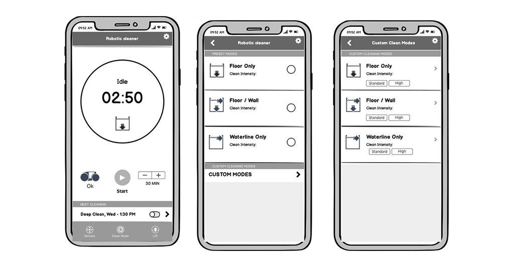
I used a formative qualitative lo-fi prototype testing with 5 users to gain insight on overall hierarchy and general flow for mode selection. Users thought the dial dashboard was familiar, informative and contained important status they felt was most relevant, operational indicator, mode state, cycle timer and informative next schedule. Users felt the clean mode selection was simple and offered good customization that was clear.

I felt I had enough data to move into Hi Fidelity exploration and share lo-fi testing results for stakeholder buy-in to move into formative testing in hi-fi. This would steer our assumptions into a better path.
After sharing competitor discovery, lo-fi testing results and hi-fi options for home screen and cleaning modes I had obtained stakeholder buy in with some changes. There were concerns that the proposed home screen UI, although tested well, didnt align with current packaging which featured the homescreen. Because next print run and app deployment didn't align in time, I determine a UX tradeoff of the scheduling location and background color was needed to maintain product integrity.
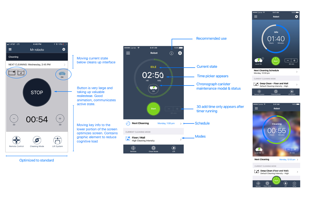

I used a quantitative true testing method for the summative hi-fi prototype. This would give us an overall assessment and data to compare to the legacy app as a baseline. I tested 5 remote users on specific hierarchy and custom mode selection. The same day I tested internal users on a our current legacy app as a baseline comparison to the redesign. The result was an increase in home screen hierarchy understanding and 27% increase of retention in the use of cleaning mode selection. Users no longer were confused by modal background clutter when selecting modes, creating quicker interactions and better understanding of operation through informative text and proper labeling.
Below the prototype has evolved since UX tradeoff to meet packaging requirements. This new design is more flexible to accomidate new features such as Smart Cycle & Spot clean which I'll touch on further below.
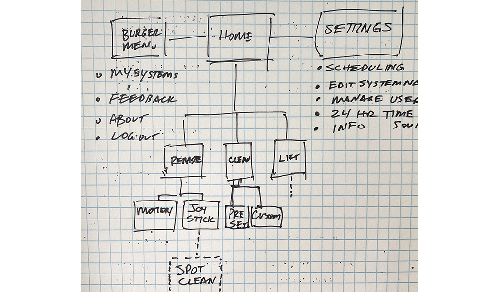
The over all site map show's what part of the user flow clean modes fit into. Other features based on existing firmware logic needed to be examined tested for the whole app to have a cohesive functionality
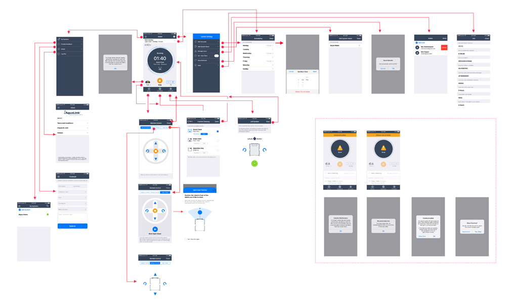
After working through the home screen hiearchy and clean modes it allowed us to concentrate on new features. In this flow you can see the Smart Clean feature was added above cleaning modes. This was where users expected to see this feature and the new design allowed it to be added in later deployments without too much disruption.

The primary persona “Homeowner Haley”, wasn’t interested in learning anything complicated to operate the pool cleaner, due to lack of product knowledge, and relied on mental model interactions. Qualitative customer operation interviews indicated that users wanted an easier way to pick up debis in a focused area. They wanted automated assistance instead of steering the cleaner back and forth. Spot Clean feature was created to address this pain point, however, in order to properly use Spot Clean the robotic cleaner needed to be position properly for the automation to make a difference. The challenge was to inform the user on propper positioning and inform as to what path the robot will take after engaging spot clean.
Research, Expert Interviews (customer ops, stakeholders), Mobile iOT understanding, UX Design, UI Design, Lookback user testing, Prototyping.
UI and UX designer to design, iterate and deliver to dev’s for deployment. These task's included user research, concepting and creating the visual design and UI patterns. I collaborated with front end engineers, product manager and stakeholders to come together in a workshop exercise to explore UI options and to meet required goals.
Produce UI based on new design patterns, test, iterate and release into the wild, and get feedback. This app is geared towards the swimming pool owner “Homeowner Haley”.
Product should allow Haley to:

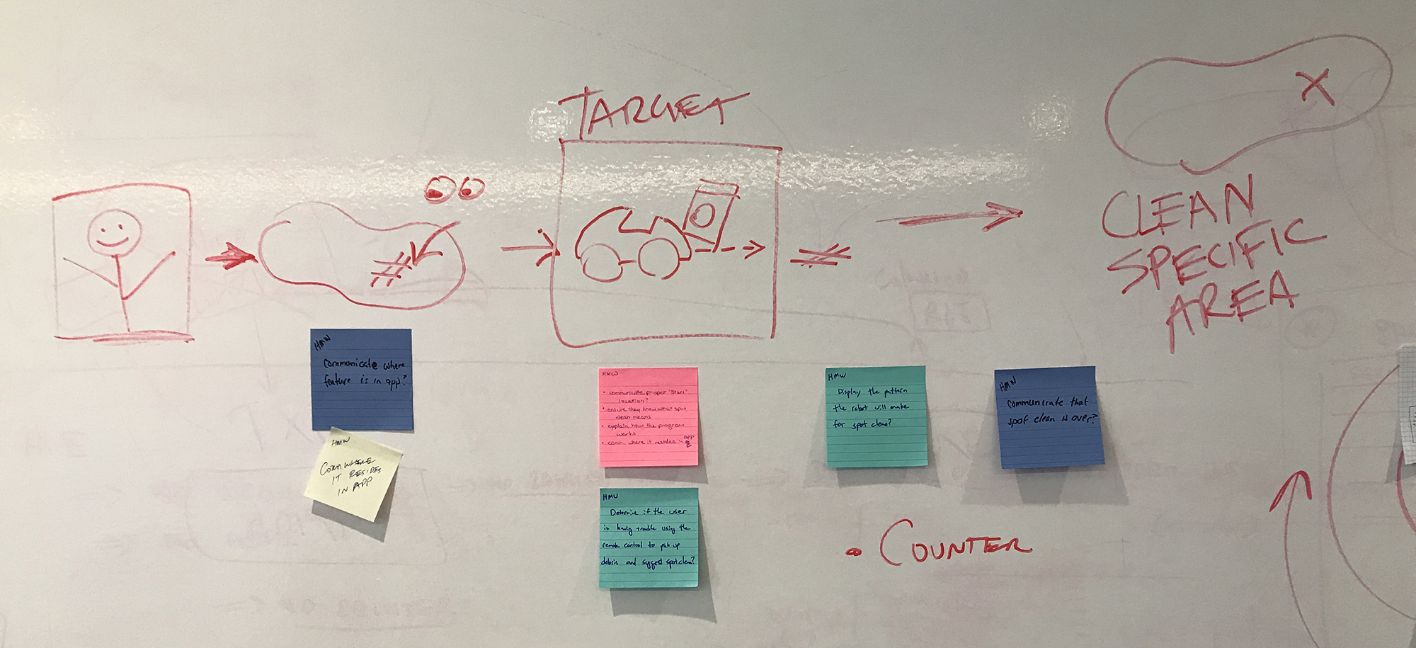


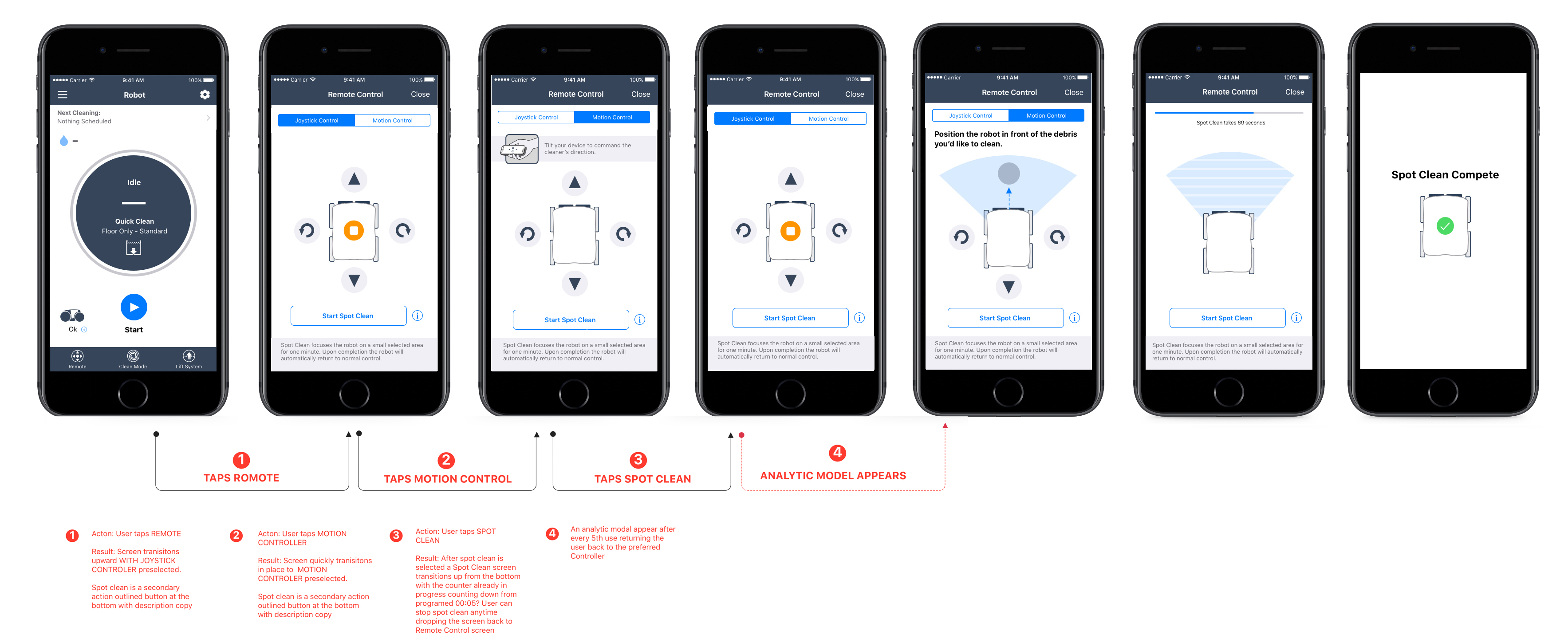
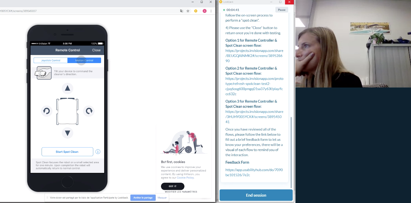
After sharing my wirframes with more users I narrowed down the intactions to two options for the spot clean feature. Was was evident was how the user seeks spot clean or do they discover it. Also how do we inform without a pesky modal that they have to dismiss. In order to meet our testing goals I conducted a remote A/B testing in Lookback. In the end we allowed spot clean as a secondary button that the user could use anytime in remote control mode. To understand how to position the robot in spot clean a simple (i) icon was placed next to the secondary button allowing anytime instruction. This solution tested well and was moved onto final deployment.

App Store & Google Play: The iAquaLink MVP release was comprised of 5 equipment modules within iAquaLink.
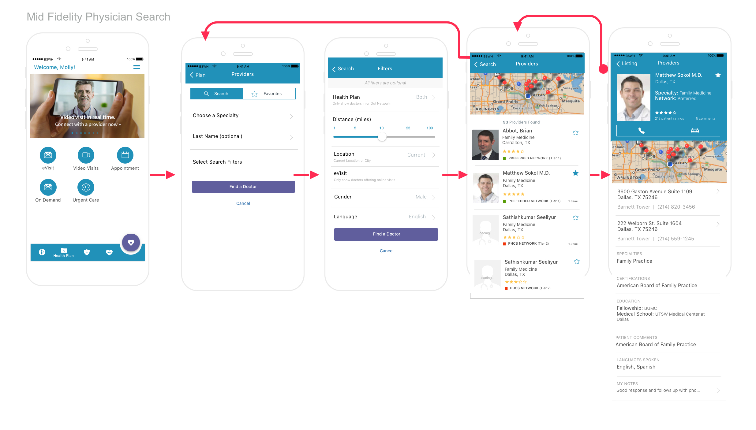
This case study will show how I provided the client with valid solutions to their needs for the long term with optimized navigation, user flow and solutions to lower development cost.
The client brought me in the beginning of of their sprint cycle to create hi-fidelity screens from existing design patterns & user flows to QA & stakeholders for final approval, then hand off to developers within Zeplin. In addition to their immediate needs I was asked if I could solve for the physician location search screens & user flow, conduct heuristic evaluation and offer a redesign of the dashbaord that must have marketing presence. They were interseted in unique micromotion where it makes sense.
Competitive Research, Expert Interviews (customer ops, stakeholders), UX Design, UI Design, Microanimation & Prototyping.
I was the sole UX & UI, visual Designer for a small team of 8 developers, 1 prodcut manager. I conducted user research with internal stakeholders, and conducted heuristic evaluations, micro-anmiation to navigation and paralex scrolling, restructured navigation and feature flow.
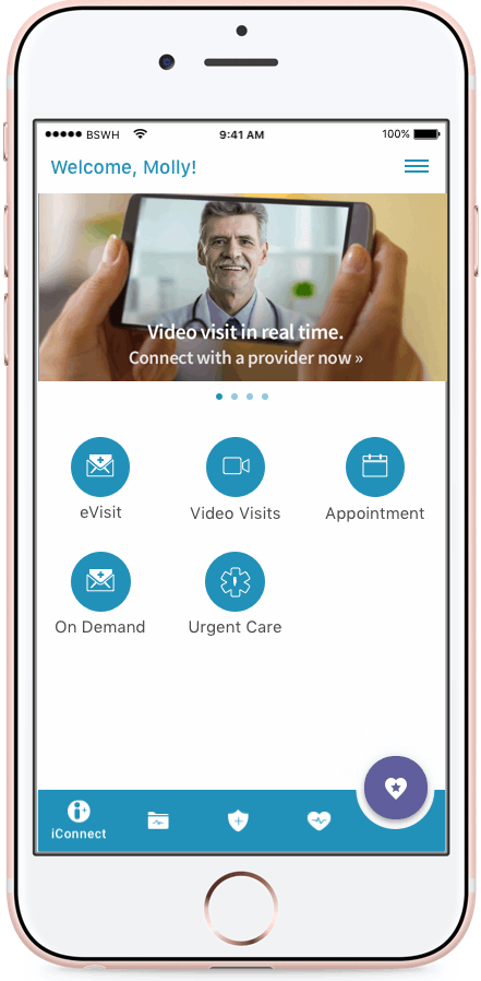
BSWHP user to be all about getting things done. About getting answers to their insurance questions. It’s a task-oriented app for current members. Design will be centered on allowing the most frequent and critical task to be completed as simply and easily as possible.
I spent time reviewing the existing mobile app - content, examiming key task flows, and reviewing features.
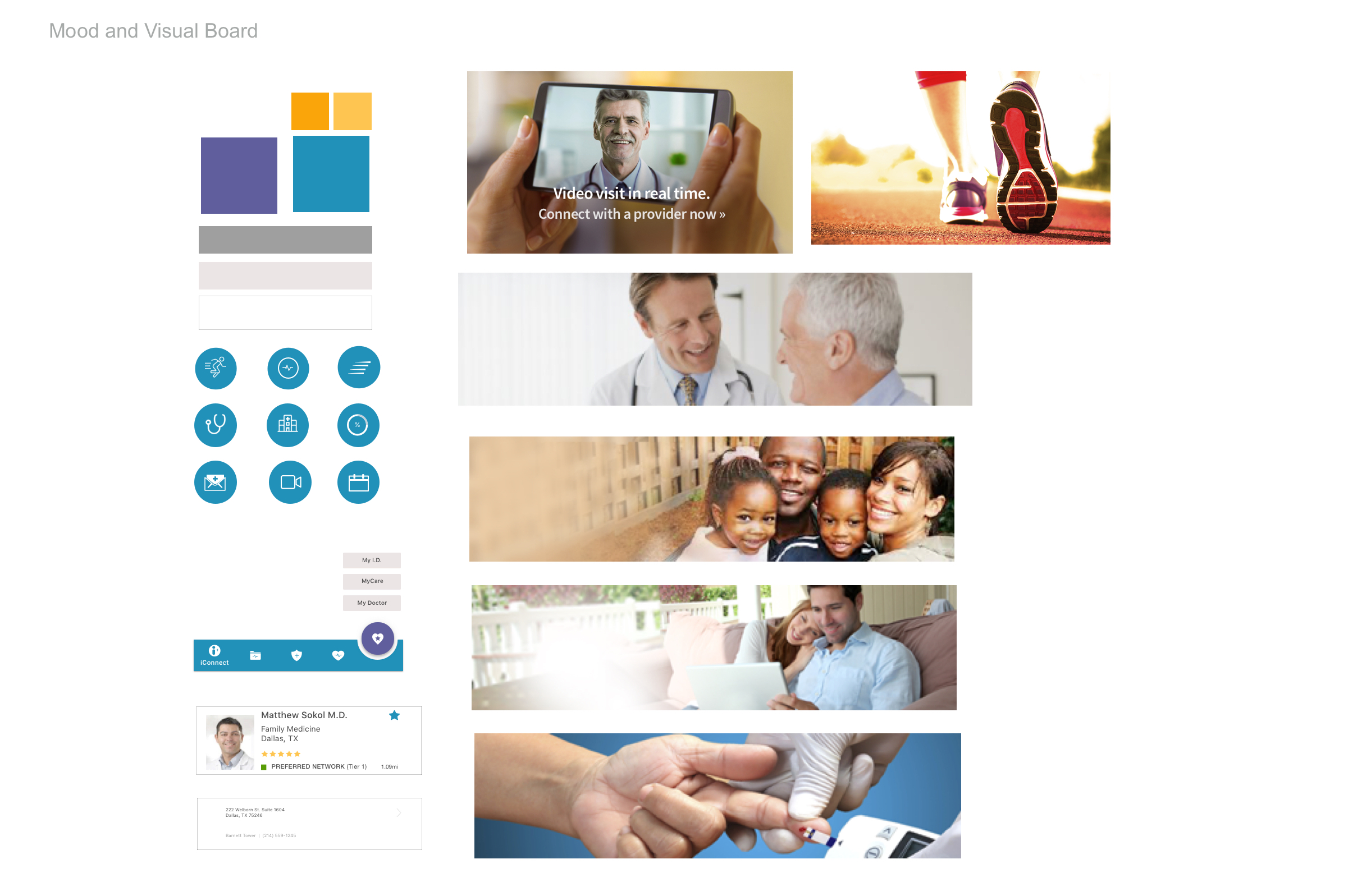
Stakeholder InterviewsMy research involved meetings with the marketing, technology, enrollment.
Competing AppsI examined numerous industry apps with a focus on modern digital presence. Humana, Blue Cross, Anthem.
Informal input into Information ARchiteture from internal staff
Visual BoardEstablished mood and visual language
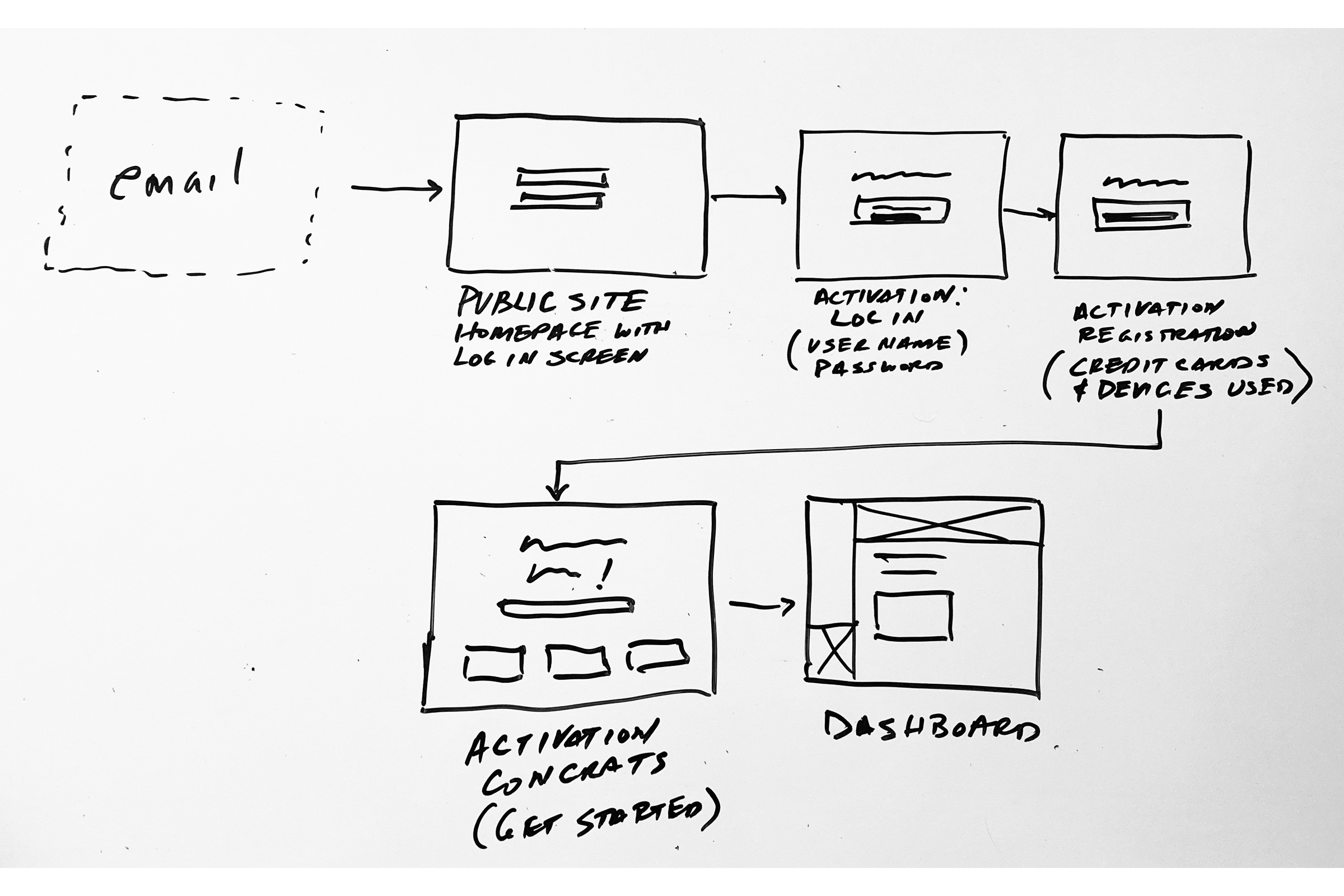
Suggested Tone and Voice - The BaylorScott & White Plan is...One of the first ways users discovered the mobile app outisde of marketing is the web portal, shown here. I also created a registration flow while discussing with product manager for better understanding of what the user goes through.

I sketched several options and shared with the product manager and stakeholder to share my thoughts and direction before moving onto wireframes. I then used schema layouts to provide a quick visual of content to discuss mapping of the architecture


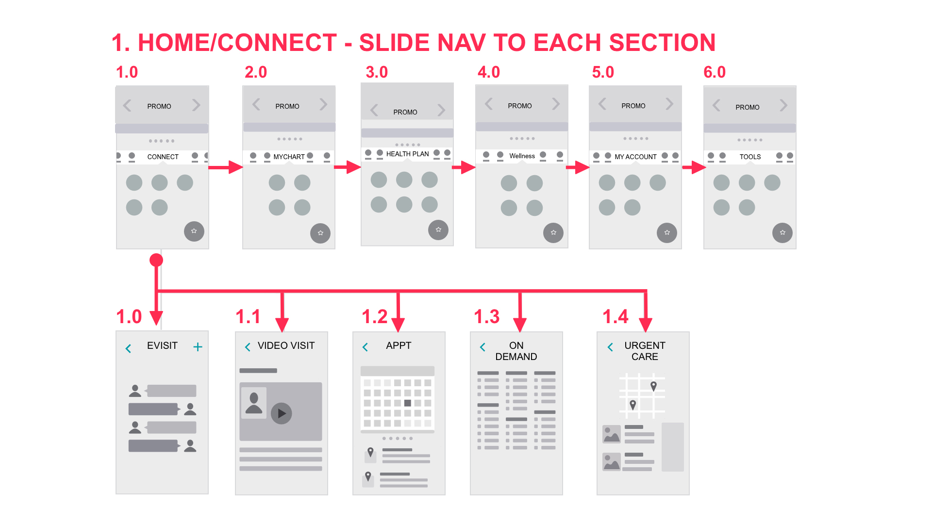
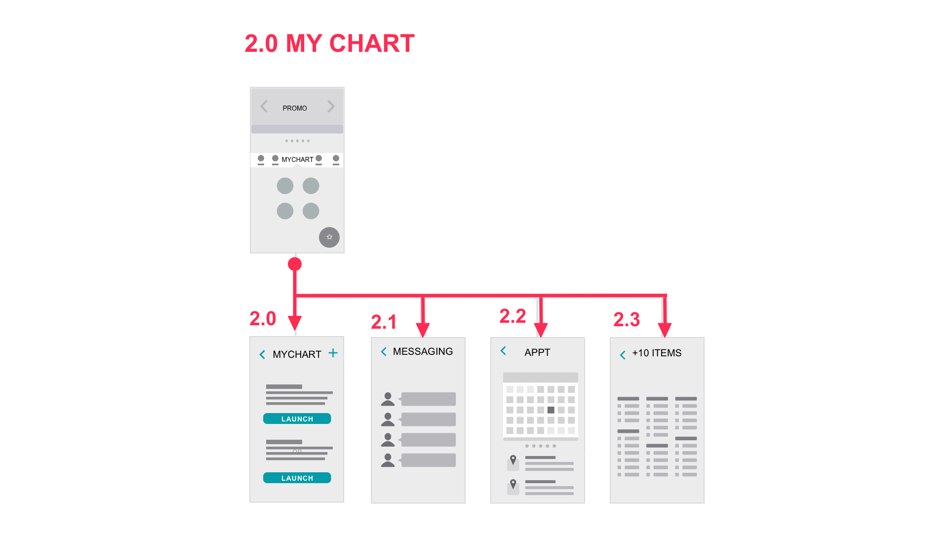

I wanted to bring the discussed sketches to life as quickly as possible to disccus interaction of navigation, action button and promo area. To stay inline with the project goals I suggested simple, easy personalization of the home screen with floating action button for easy recall, ie. id card, hospitals, health cards. Testing was with internal teams that was a mix of QA, Product Mgr, Operations with over all good usability I moved onto higher fidelity
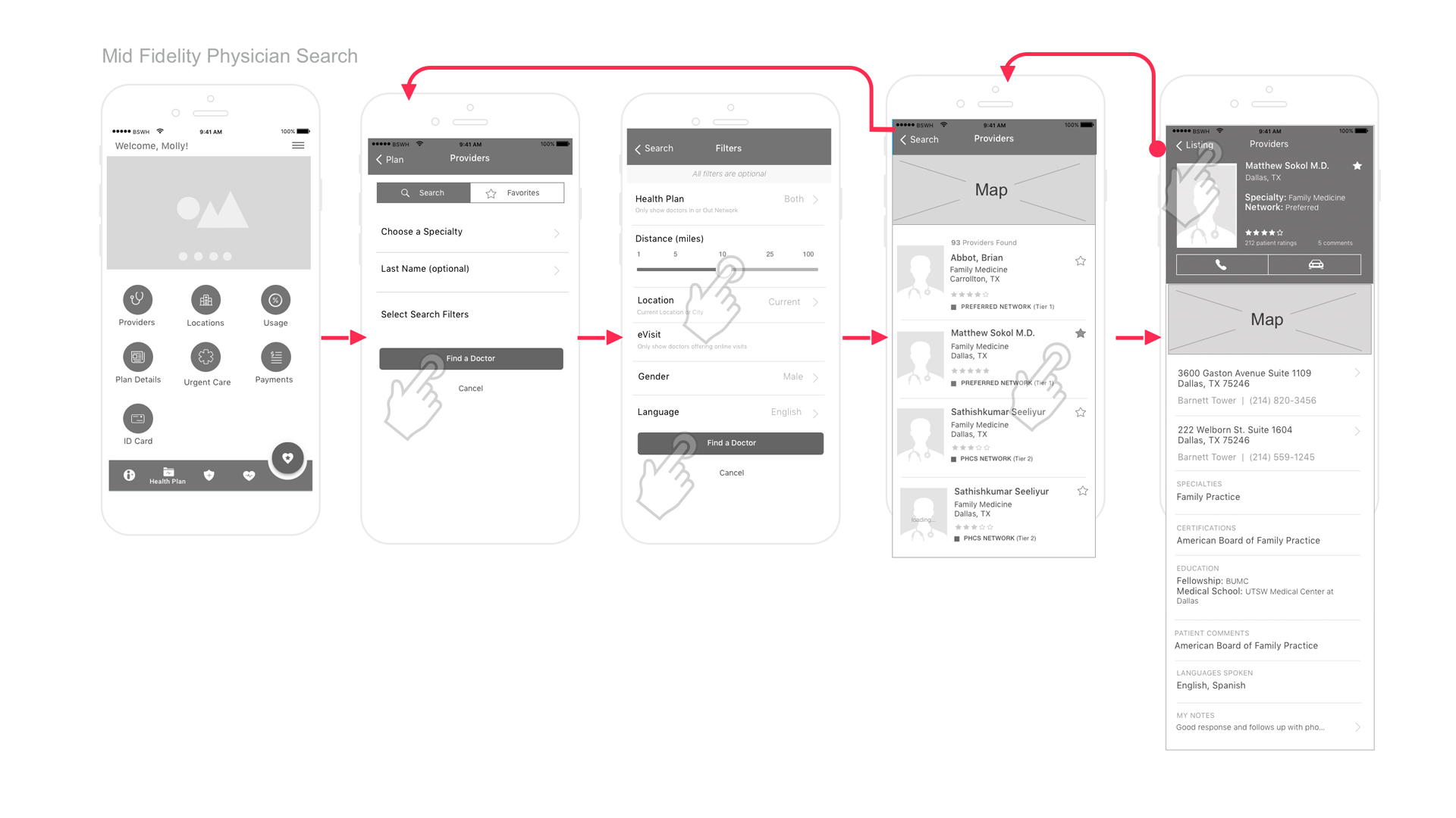
Ater implementing visual ques and brand guidelines I was ready to prototype. My contract ended and I was unable to continue with iterative baseline redesign testing. The client appreciated advancing the product interaction and was looking forward to testing as they moved into other iterations.

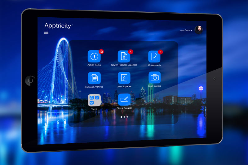


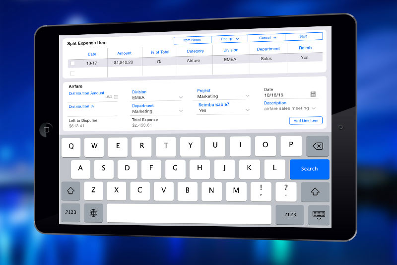
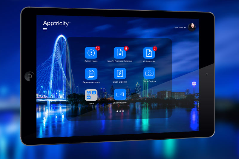
To meet their clients' needs, Apptricity wanted to move the outdated looking desktop expense software to the iOS tablet platform.
We evaluated the information architecture, simplified the navigation, and streamlined the user flows for an on the experience. Various features were created, such as drag and drop & dynamic modals.
The client was excited about the new UI and was able to present the prototypes to the prospective client before development stages.
Client: Apptricity
Role: UX Design, UI Design
Tools: Omnigraffle, SketchApp, Invision, Photoshop, After Effects
Visit the Prototype
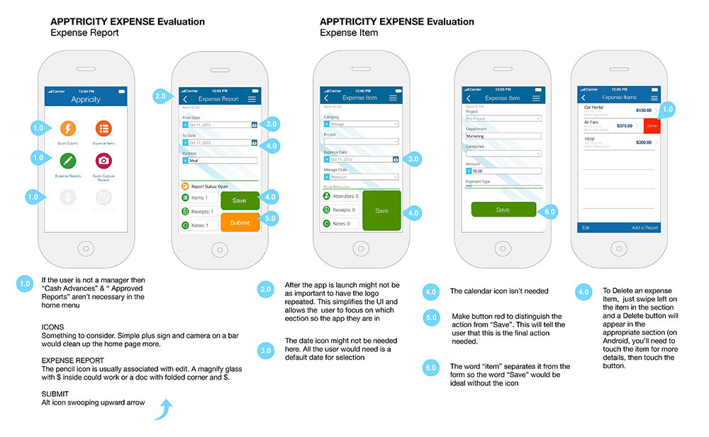
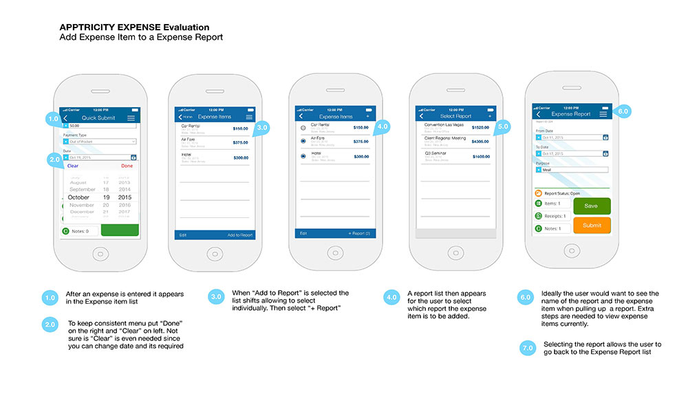
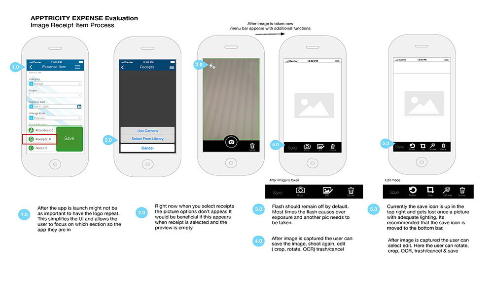
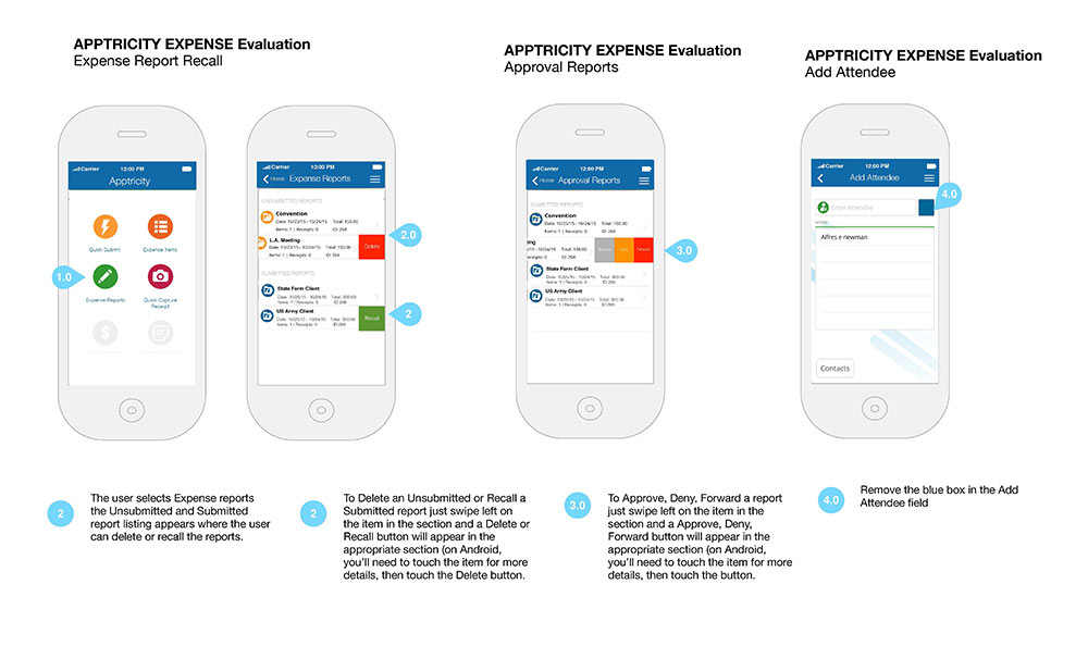
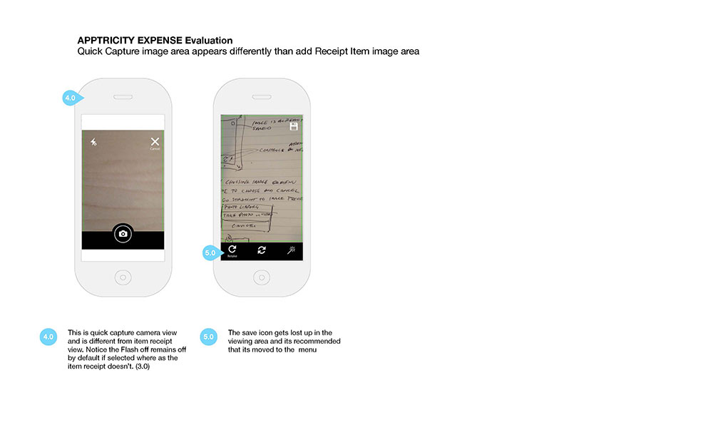
This is an example of some wireframes I created in Omnigraffle to address a few pain points. The stakeholders wanted to see solutions and recommendations on how to streamline key features.
I was asked to do a heuristic evaluation on the existing mobile ui and offer solutions for the developers in the next sprint.
Role: UX Design, UI Visual Design
Tools: Omnigraffle

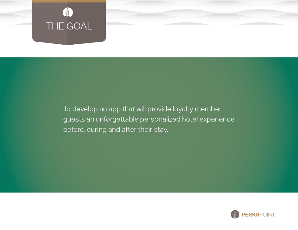


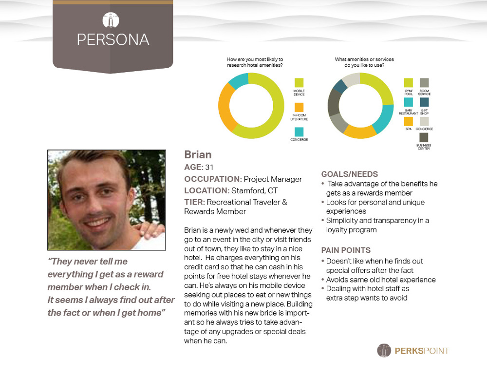


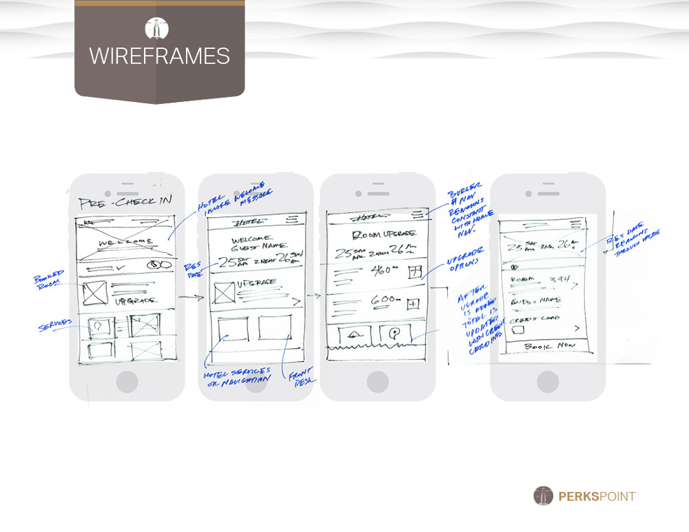


I designed this app for the hospitality industry to provide reward members with a customized experience during their stay. By addressing the industry's pain points, I came up with some solutions to engage guests and hopefully encourage them to return. I wanted to share the process during the development stages even though we still need more iteration & testing for the hi-fidelity prototype. I'm hoping to have a mobile app prototype soon.
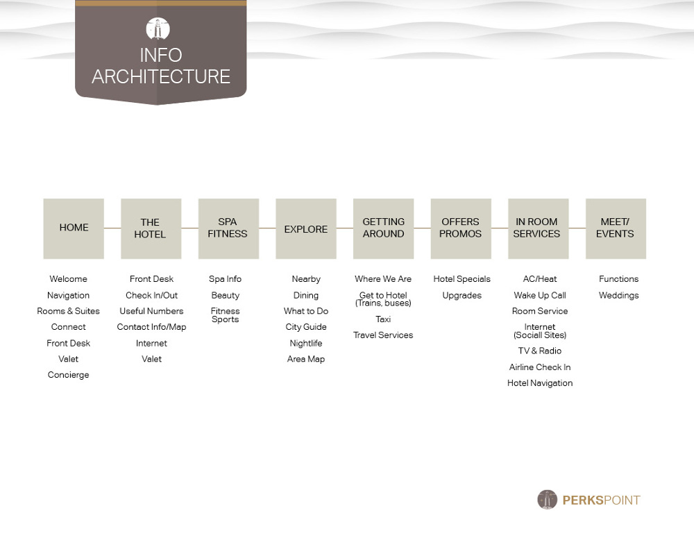
The challenge was to create a deeper connection with the guest by providing them a customized and streamline hotel stay through the use of beacon technology. The approach was to offer an application that enabled the guest to check in to their room, bypassing the front desk upon their arrival. On-site navigation and keyless entry with the app allowed the guest to go straight to their place.
Customized interfaces allowed the guest to control everything n their room from curtains, lights, thermostats, and tv all from their application.
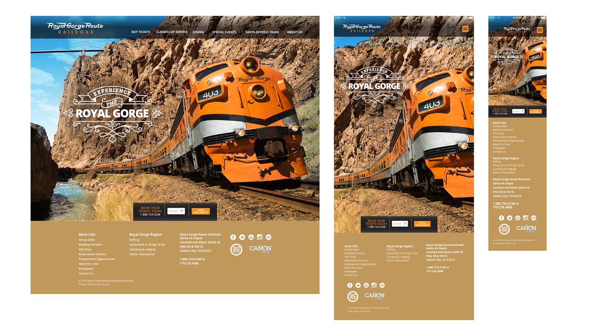
Role: UX & UI Design, Visual Design Tools: Omnigraffle, SketchApp, Invision, Photoshop, Indesign Visit the Prototype in progress.An ad agency in Denver, CO, hired me to redesign their clients' website Royal Gorge Route (RGR). They requested that I customize their CMS site by redesigning the home page and interior pages for events, dining, and promotions. I was to consider the best approach for a flexible promotional overlay. Additionally, they requested that I design a booking widget for hotels, vacations, and train tickets that a user would find useful on the home screen.
User Interviews, UX Design, UI Design, Visual Design, Prototyping.
I was the sole art director, UI & UX Design of the landing page and inernal pages.
Increase retention through user exploration. Greater awareness of season promotions with quick and simple bookings for the train, hotels & bundle packages.
Evaluated existing content and determined best ways to use assets. I met with stakeholders to determine what their goals and interviewed seven internal/external users to discover what they considered essential for booking a ride on the Royal Gorge Train.
Stakeholder InterviewsMy research involved meetings with the marketing, current developers to see what was feasible.
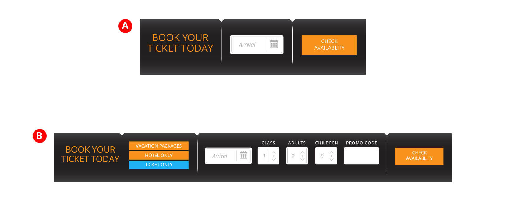
I provided A/B options in Invision to determine what users found to be their wants and needs as they explored the home page and moved onto buying tickets. I open ended asked question to determine if the ticketing widget was noticeable, necessary or desirable?
I compared two booking widgets:Surprisingly against the clients assumptions, I determined that users weren't interested in hotels or packages on their initial visit; they were more interested in exploring and then book from within site. I discovered returning users were more task-oriented and more likely to book a train ride, and less interested in a hotel or vacation package. Most felt they had other trusted avenues to accomplish this. So in this particular use case, Fitts law applies where required time to get to their ideal task was unecessary. Since most users are first time visitors My recommendation was to not have this feature on the home page and rely on the link in the menu to drive the users to the booking feature where they have full visibility of events, class pricing at time of booking.
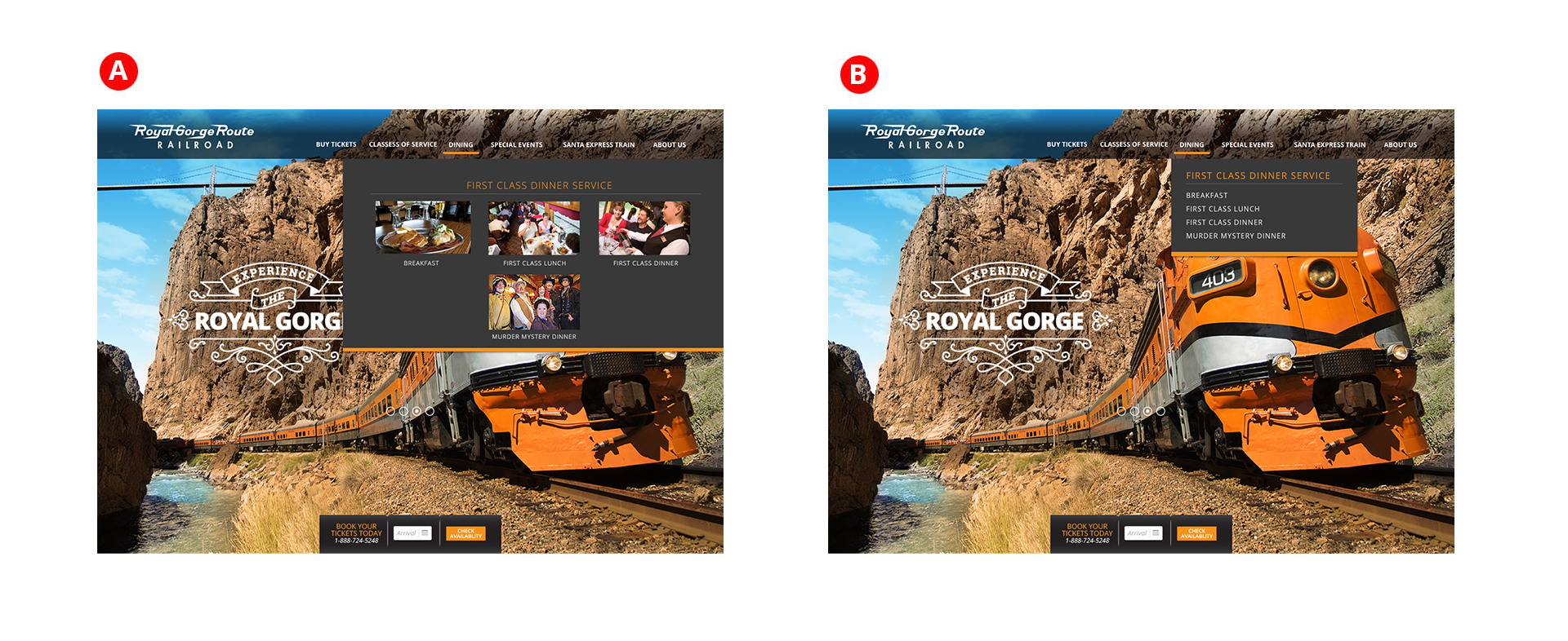
Assumptions were made that visuals in the mega menu would encourage exploration and interest from the users. To test this, I provided A/B options in Invision to determine what users preferred when navigating the site in dining and events. I tested five mix of internal and external users and found that users appreciated the visuals but had a good grasp of the categories and appreciated a quicker navigation experience rather than the additional cognitive load of visuals. Users found themselves spending more time looking at the images than if they were to simply click into their selection. User feedback also indicated that the images would be unecessary on return visits and could be a pain point.

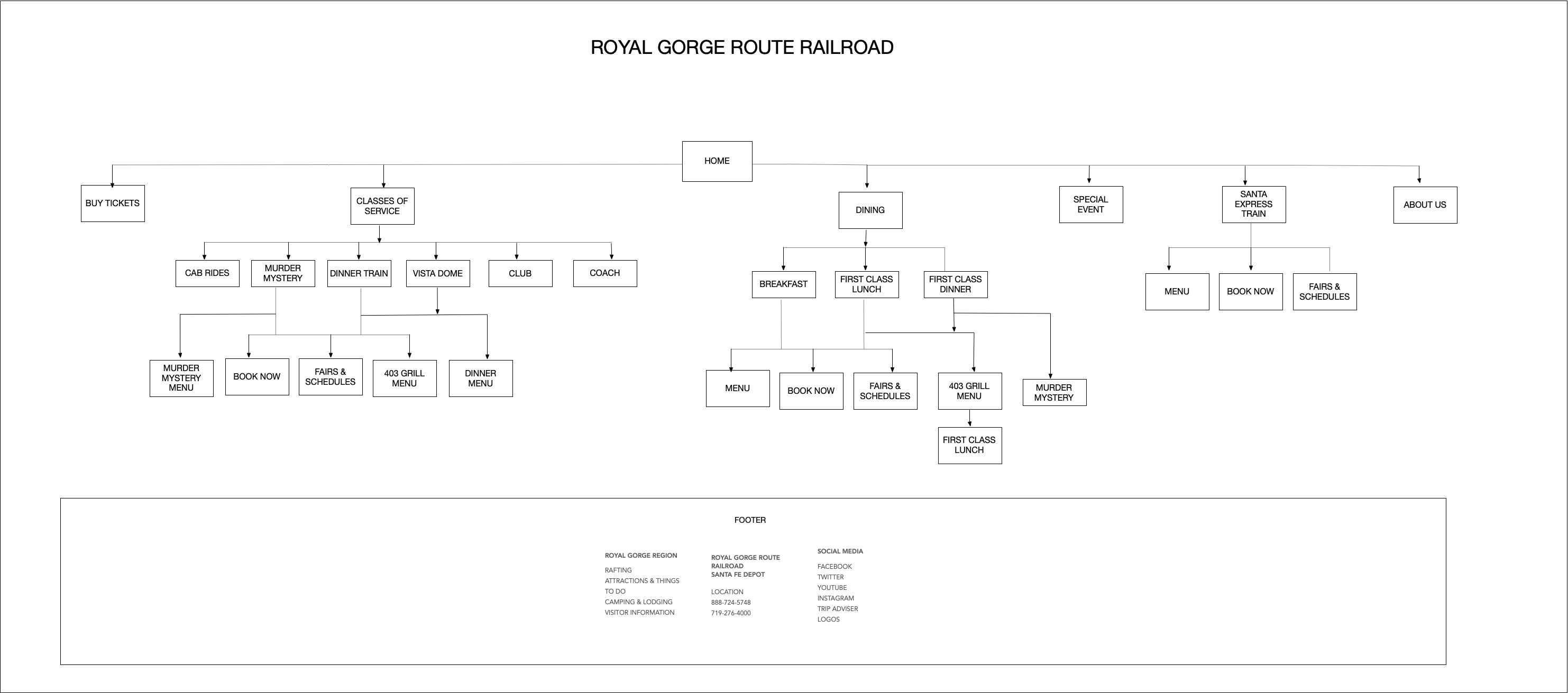
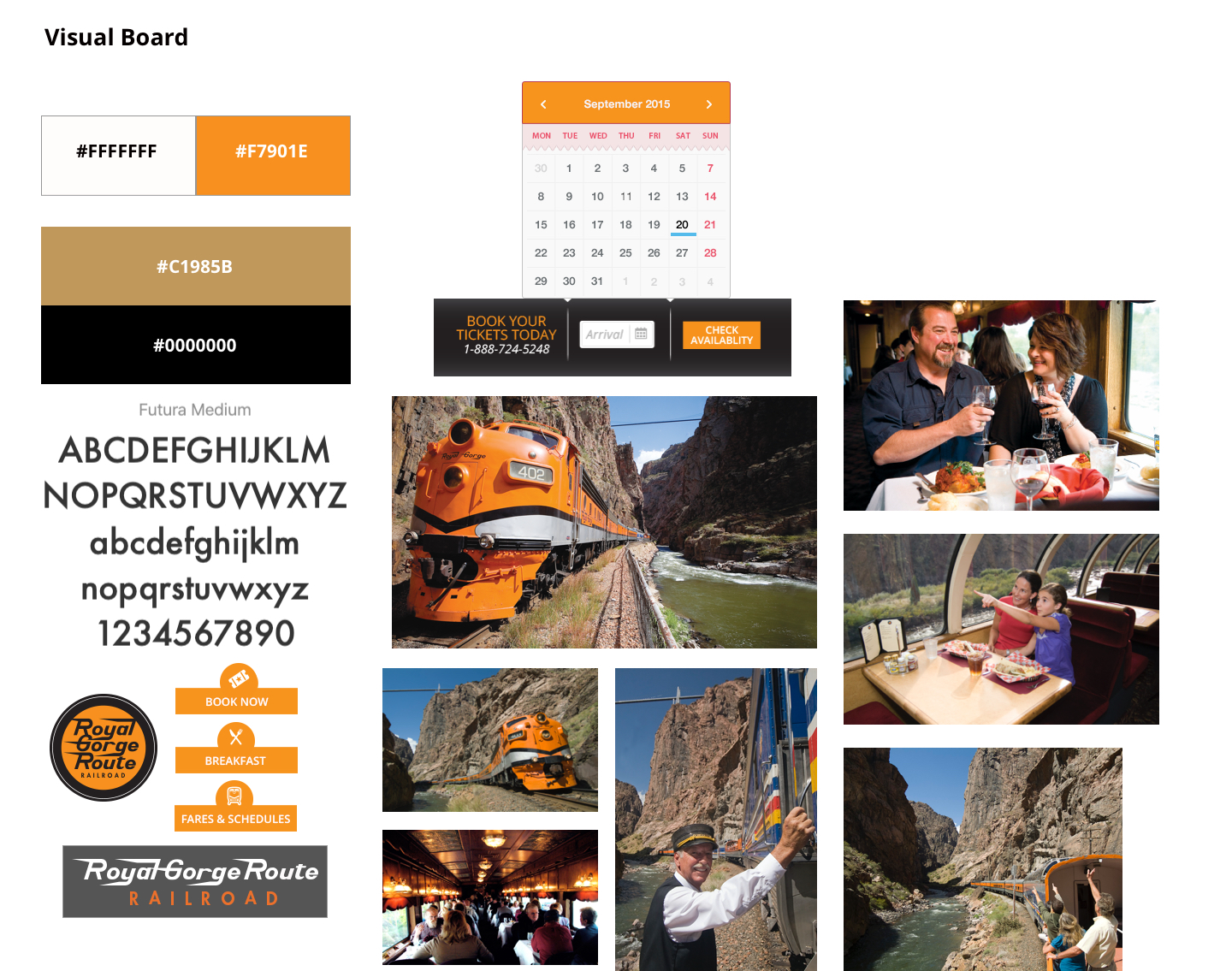
I sketched a few options to show the different approaches and quickly wireframed my recommendations and presented these options with a visual board to discuss element options. The client was accepting of the promotional badge overlays and approved me to move forward to design twelve custom promotional badge overlays.


In addition to the site I art directed and designed an outdoor option for the agency to promote the website.
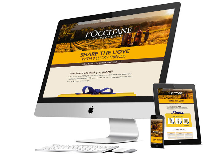
L'Occitane requested a new look for their "gift a friend" promotion that was responsive and featured three of their best selling products. The email served as a way to offer registered users a chance to give exclusive gift packages to 3 of their friends in exchange for their information. As a point of entry, the users go to a responsive landing page. If the user left the page and came back later, the forms retained the information until all three friends were complete. The client was please with the new direction and was eager to test the promotion in the tri-state area before going nationwide.
Role: ACD, UI Designer
Select & scroll to view entire Email
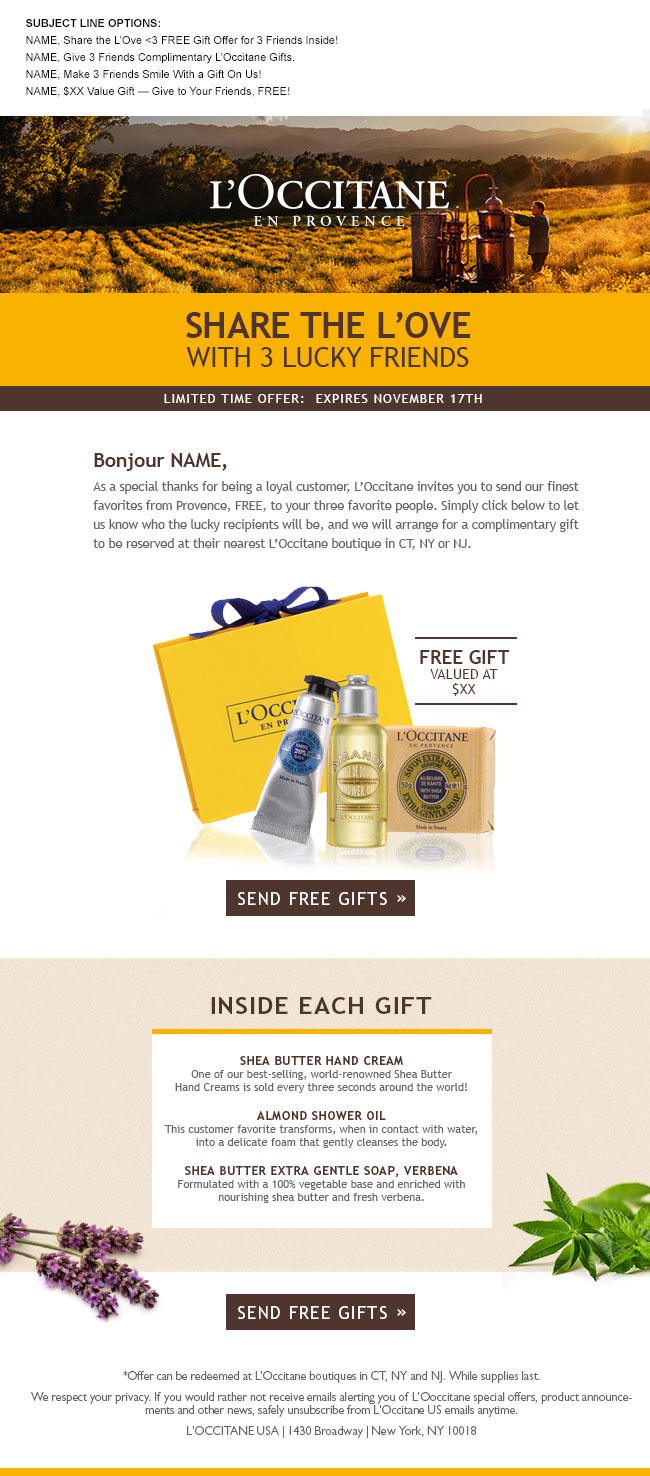
Select & scroll to view Mobile

Select & scroll to view Landing Page
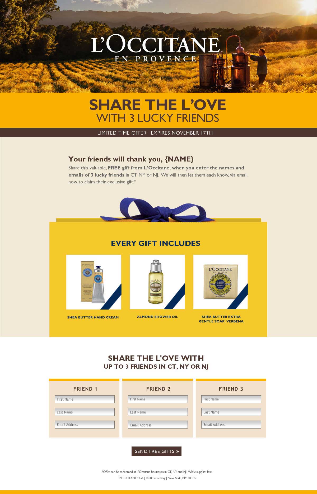
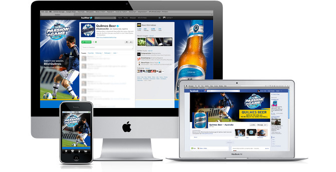

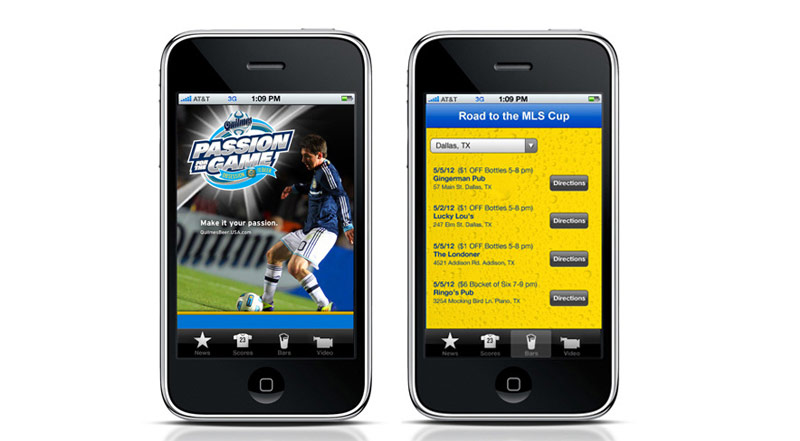
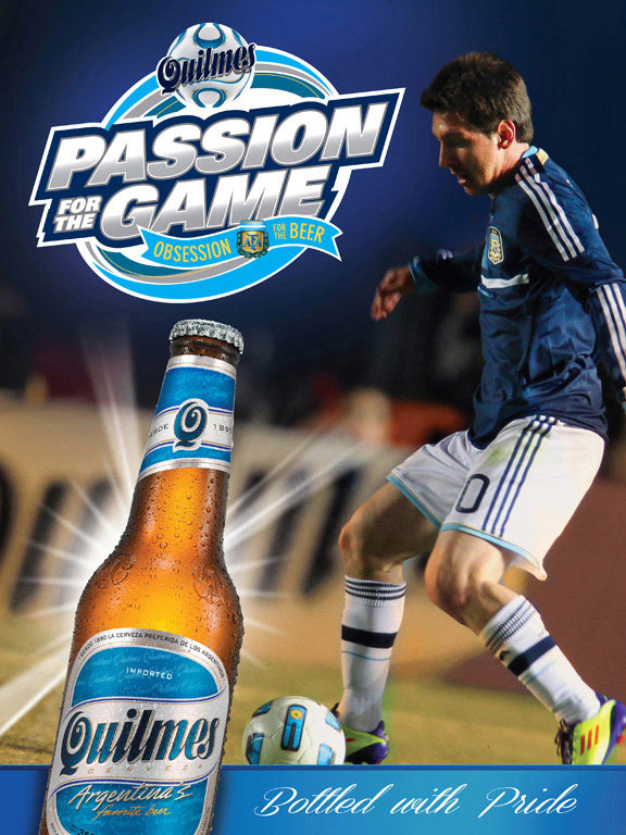
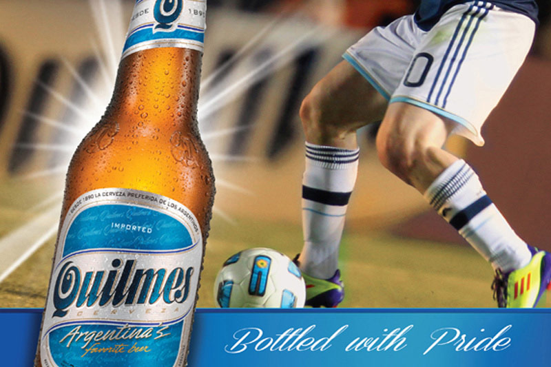
 Quilmes had limited distribution and were available in select markets. The strategy was to differentiate itself by building on its deep heritage in Argentina Soccer. We proposed that they rely on the MLS relationship through on-premise events during the World Cup. Fans could post their experiences during the games and sign on to discover the location for the next one. I also created a promotional logo.
Role: Creative Direction, UI Design, Visual Design
B. Love Them Again, Role: ACD, Production: Suspect Film - CGI & Illustration
C. Love Them Again, Role: ACD, Production: Suspect Film - CGI & Illustration
D. It's a Colourful World, Role: ACD, Production: Suspect Film - CGI & Illustration
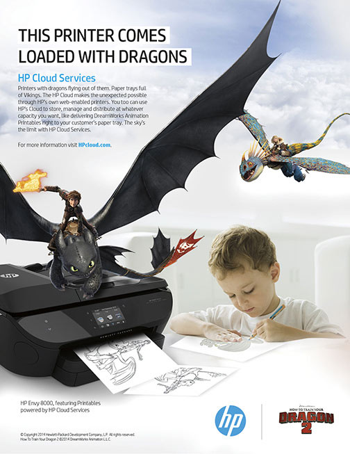
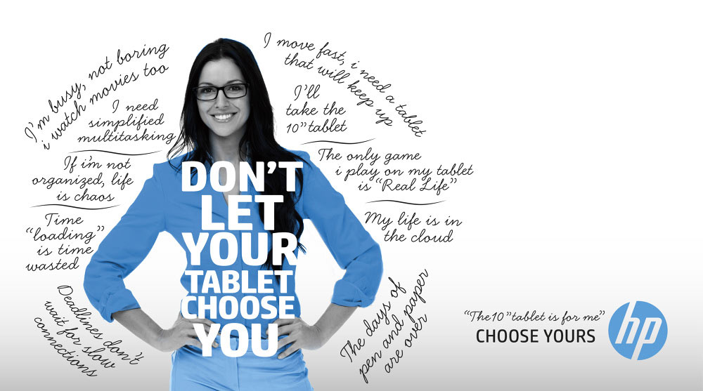
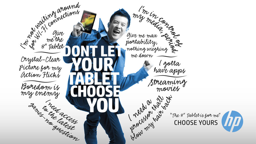
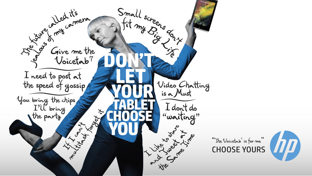
E. Dragons Inside, Role: ACD,
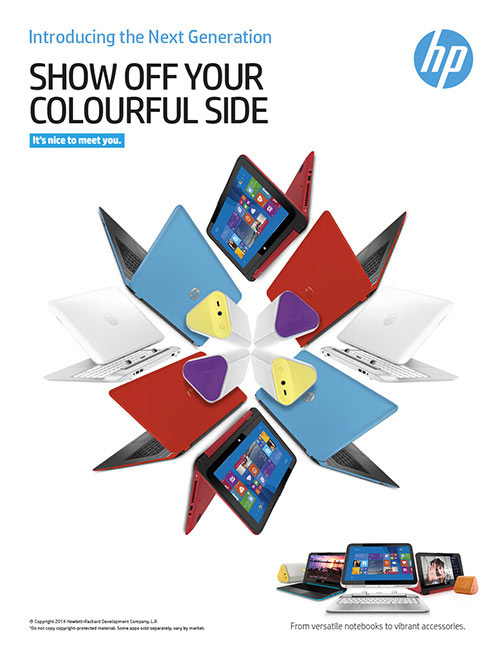
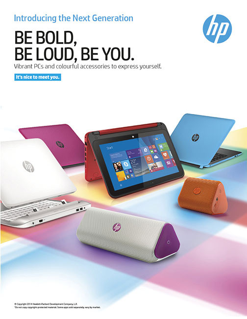
HP offers a tablet with features for everyone. These concepts were sold to establish a theme for a trade show but never actually produced. I liked how the story came to life, so I wanted to show them.
Role: ACD, AD
A. Smart Friends We focused on different scenarios and devices that HP SmartFriends can support. We chose to use a real rep for a believable personal connection.
B. Love Them Again The popular HP Pavilion Notebooks relaunched with new colors, features, and price points, which deserved another look from consumers.
C. HP DataPass This story is of a guy who has found himself outside his Wi-Fi network and how he overcame the frustration of not being able to connect. HP DataPass was the solution.
D.It's a Colourful World New colour drove this spot. Once again, Suspect Films took our storyboard and added extra value that made us all look so good.
E. Loaded with Dragons HP offers a printables partnership with Dragons 2 movie. The only client request was that it looked like dragons were coming out of the printer. I think we came up with the right solution.
Role: Creative Direction, Design
A. Behind the Scenes
B. The Big Game Video
C. Big Game Elements
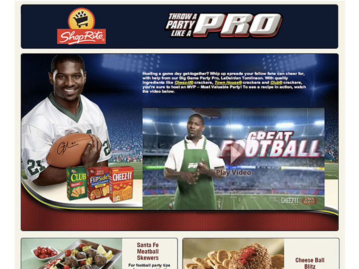

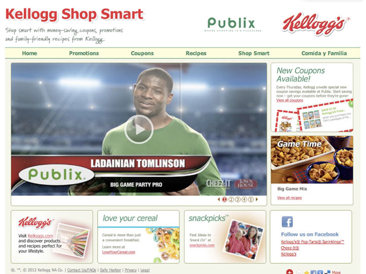
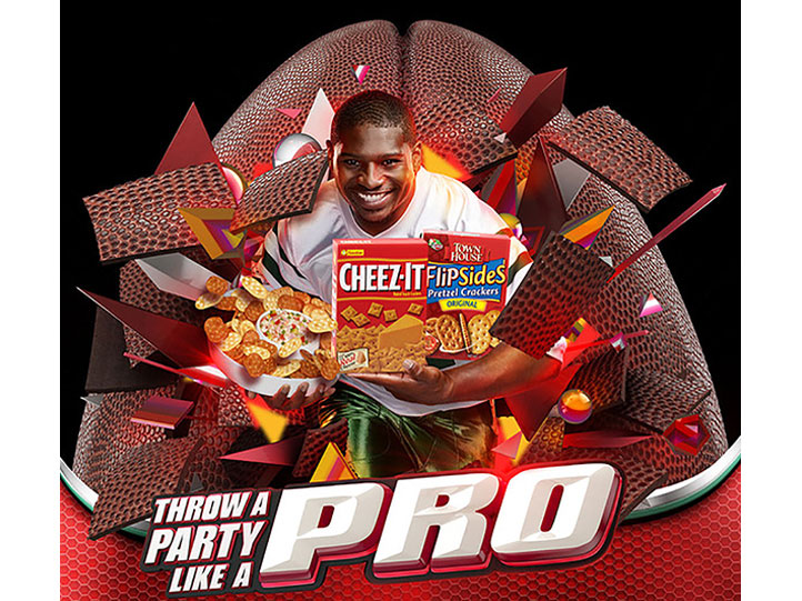
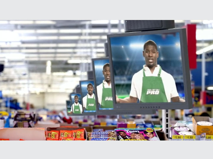
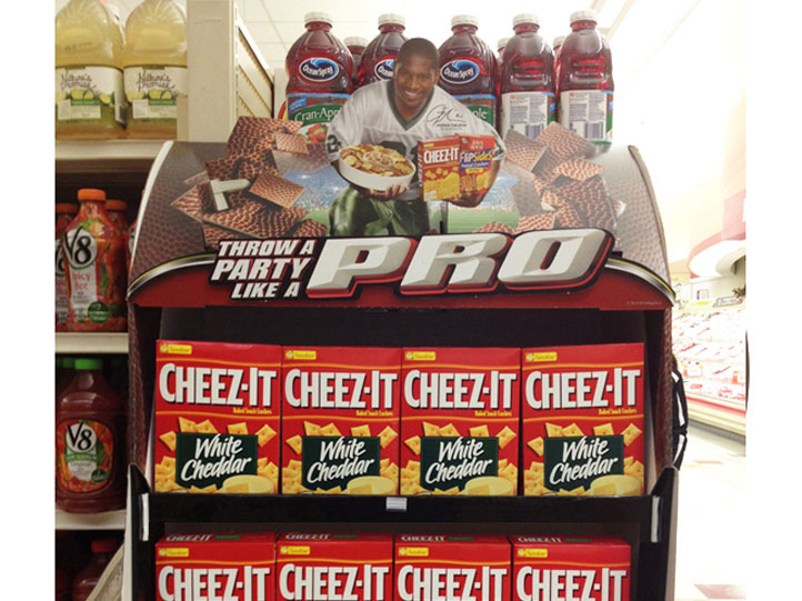
A. This salty snack promotion featured NFL running back great LaDainian Tomlinson, who urged consumers to "Avoid a rookie mistake and Party Like a Pro." While art directing with Artistic Image, we shot both video & print on one crazy day.
B. In the end, we produced and branded videos with customized recipes for six different retailers that integrated into the national campaign. Each retailer was able to use its branded content online and in-store.
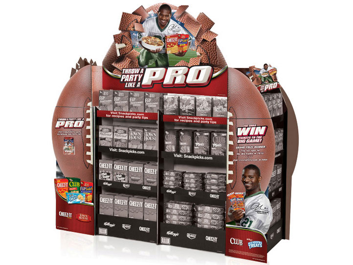
C. The POS display offered a flexible footprint and a dimensional topper with three lug-on and LED lights representing camera flashes. Recipes and cooking tips featured as a take one brochure.
Role: Art Direction, Design
Production:
Artistic Image, Atlanta


Use scroll bar to view entire email
Use scroll bar to view entire email
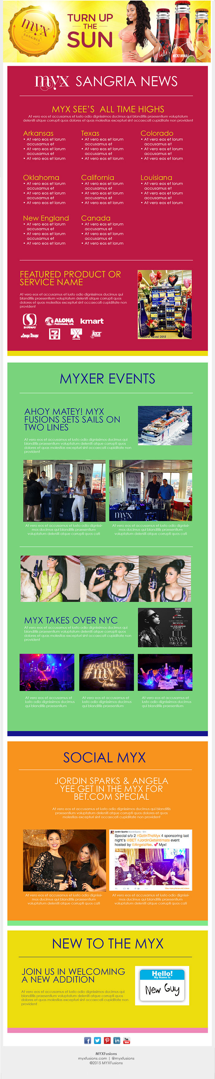
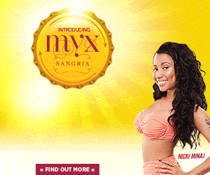
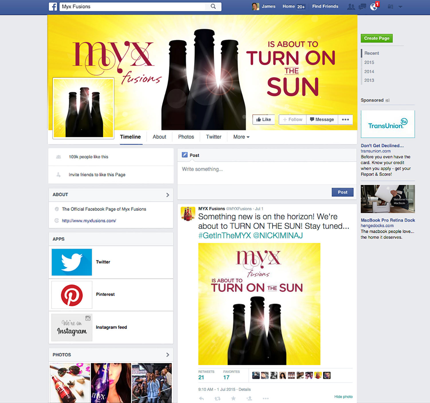
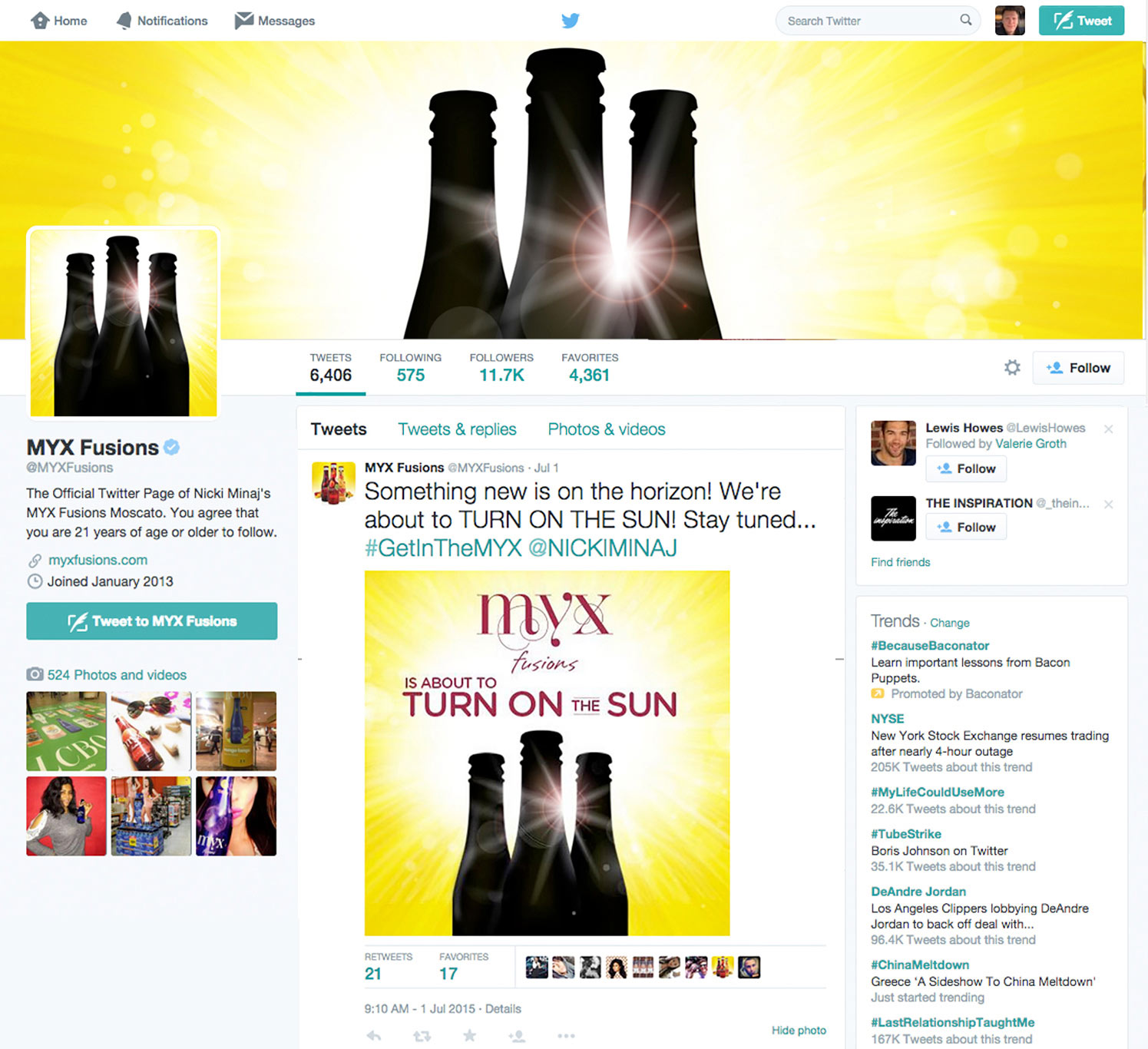
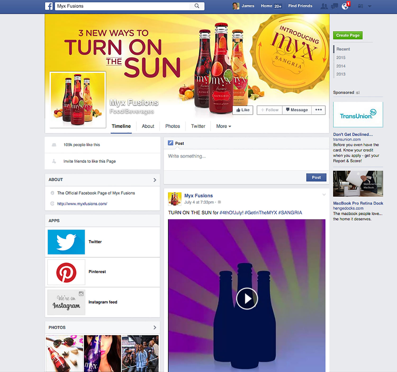
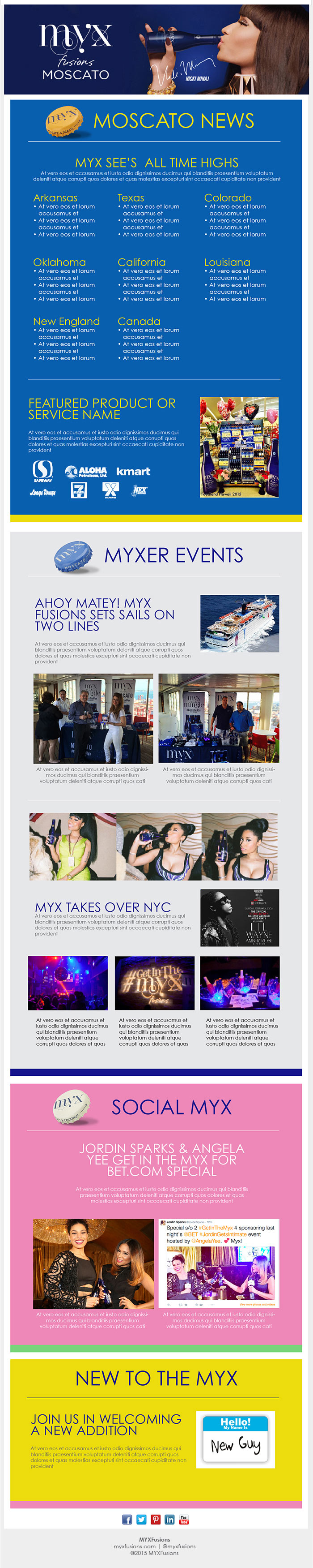
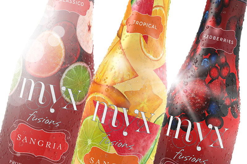
After successful sales of Myx Fusion Moscato, the brand decided it was time to launch their new Sangria beverage. The AOR called me in to help out with the social media launch endorsed by spokesperson Nicki Minaj. They wanted to announce the new drink with a teaser then roll out with "Turn On the Sun." Elements included: animated banners, design of the social pages, :15 animations, and new redesign of the email newsletter.
Role: Art Direction, Design


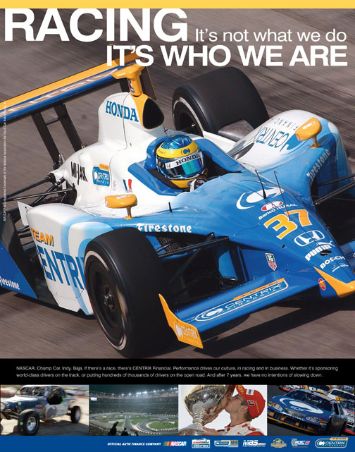

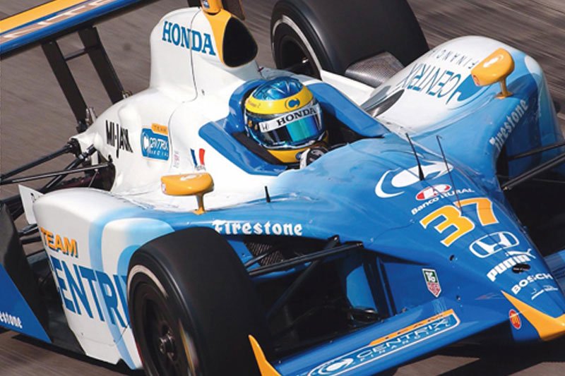
Denver Grand Prix was more than an auto race; it was a week-long celebration of golden glove boxing, extreme sport & music. I was the Senior AD that helps develop the look and feel for TV, Print, OOH. Centrix also places several ads in Indy & Nascar programs celebrating their commitment to motorsports.
Client: Centrix Financial
Role: Art Direction, Design
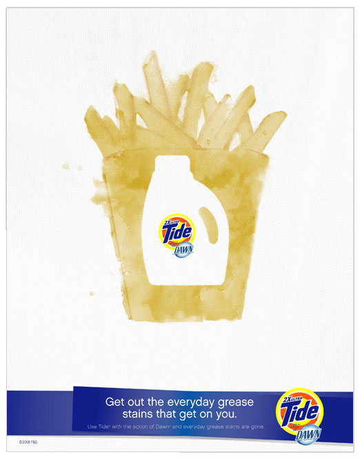
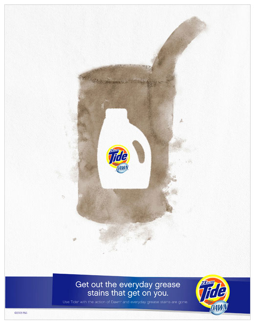


As Senior AD, I worked with a team of designers and copywriters to execute National/Global Shopper Marketing initiatives for Tide and its skews.
Reversing the silo of the packaging from the stains accomplished two objectives. Show off the new package form of the concentrated bottle and demonstrate how the grease-fighting action of Dawn is tough on everyday stains.
P&G wanted to show how the new formula saves money on every load. I proposed tucking the dollar bill into the handle of the bottle as if it's holding the savings for the consumer.
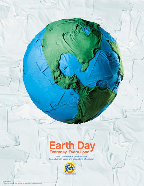
Client: P&G, Tide
Role: Senior AD
Photography: Earth Day Indigo Studios
Photography: Packaging Souders Studios
Illustration: Jeff Richardson
Earth Day Ad was nominated for a One Club Gold Pencil


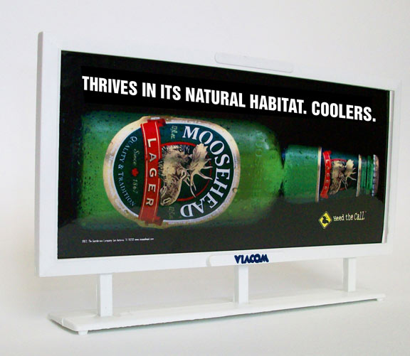
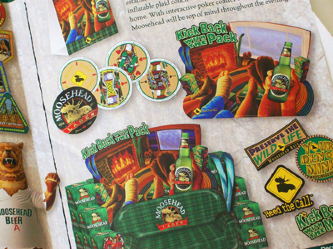
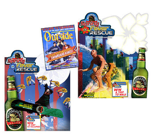
As a creative director, I oversaw a small team that produced three national promotions for Moosehead Lager over a couple of years. We developed a strategic, flexible program that distributors could customize. Additional support with ads in Outside Magazine. Our in-store displays were impactful and multidimensional, which featured innovations such as giant inflatable couches & lenticular fireplaces.
Client: Gambrinus Imports, San Antonio, TX
Role: Creative Direction, Illustration, Copy
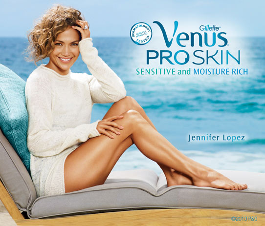


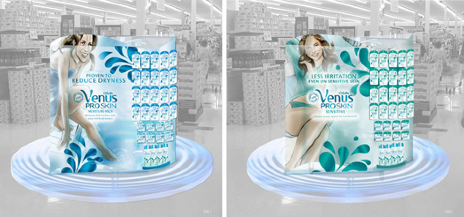
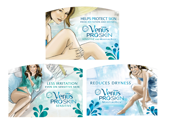
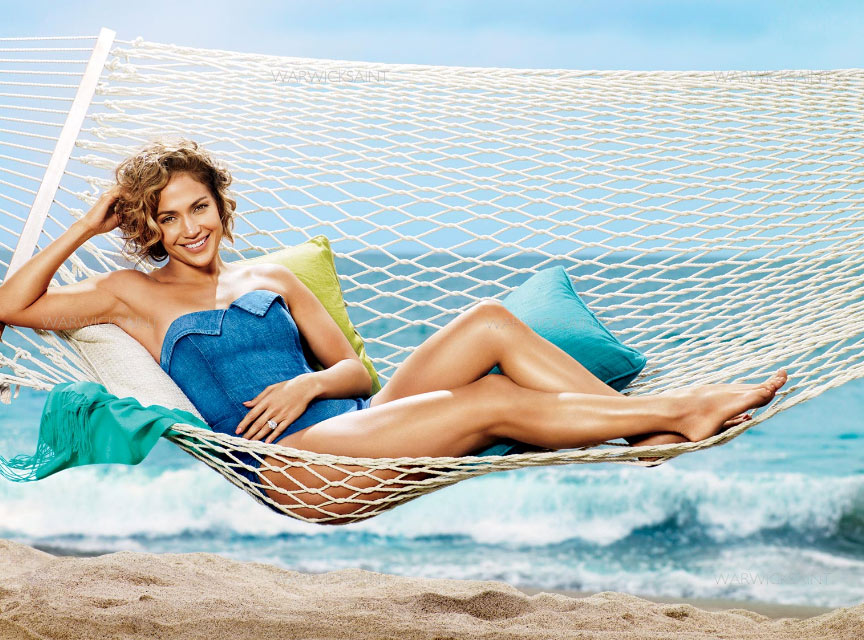
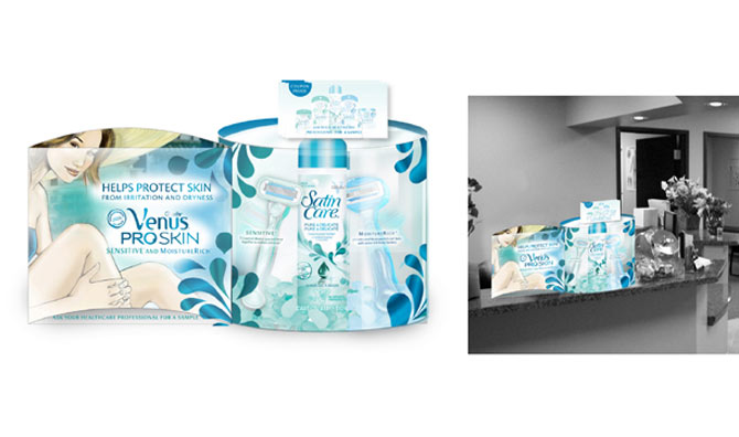
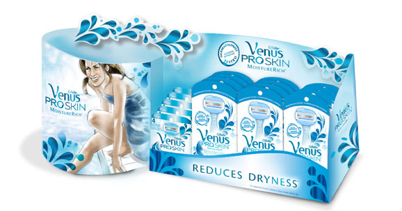
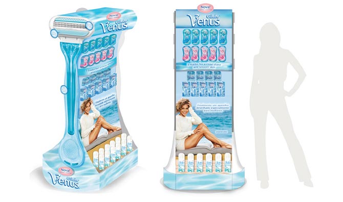
Gillette Venus was launching its new line of Proskin razors in Europe and North America as a solution to razor irritation. It was up to us to bring that education to the consumer in-store by differentiating the two different benefits for sensitive and moisture-rich.
As you can see from the comps, we had many more prods benefit specific poses planned for the photoshoot. But since this was "above the line" agency driven, our shot list was reduced but still successful.
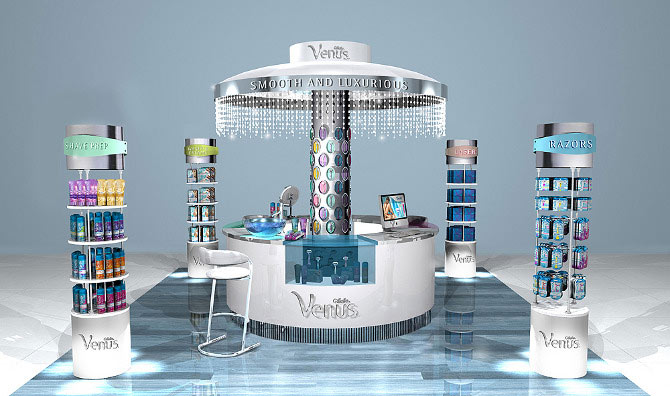
The beauty bar renderings are to represent a store within a store where the consumer has more of experiential shopping experience. The consumer could engage with the beauty expert or shop and go. These types of beauty bars are unheard of in this segment so that it would be a unique opportunity.
Client: P&G, Gillette
Role: Art Direction, Design
Photographer: Warkwick Saint
Beauty Bar Render's: BDF Design
Through out the years I've developed marks, identity and logos for retail stores, shoe apparel, national promotions to small companies.
Client: Varies
Role: Creative Direction, Art Direction, Design
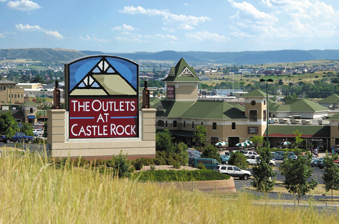
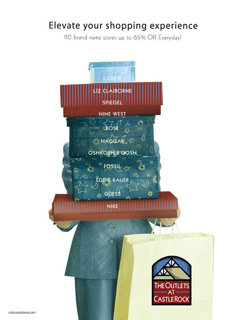
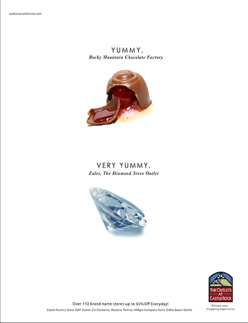
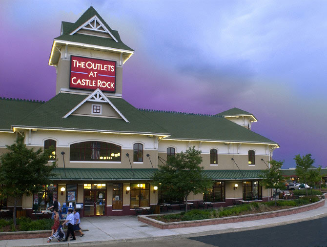

The retail management company sent out an RFP requesting agencies to bring their two locations together in look and marketing strategy. I led our creative team to pitch and win the account against other more significant and established agencies in the Denver area. The rebrand included identity, broadcast, radio, print ads, outdoor and collateral.
Client: Outlets of Colorado
Role: Creative Director, Design
After Effects motion test.

Original Mixed media on wood, 3'x4'. I designed the logo, photographed the painting and turned it into an animated gif.

Cinemagraph Test. Animation was created in After Effects, then brought into photoshop and converted to an animated gif
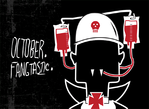
Self promotion, post card series.
I enjoy motion design and taking my illustrations to another level. The lab is where I can experiment and work things out as I learn to expand my skills. I'm planning on doing some more cinemagraphs & animated gifs based on a couple of my paintings, so check back later.
Client: Myself (toughest one of all)
Role: CD, AD, Designer, CW


